A creative direction studio founded by Marie Lusa with a strong focus on visual identity, editorial, brand identities & consulting
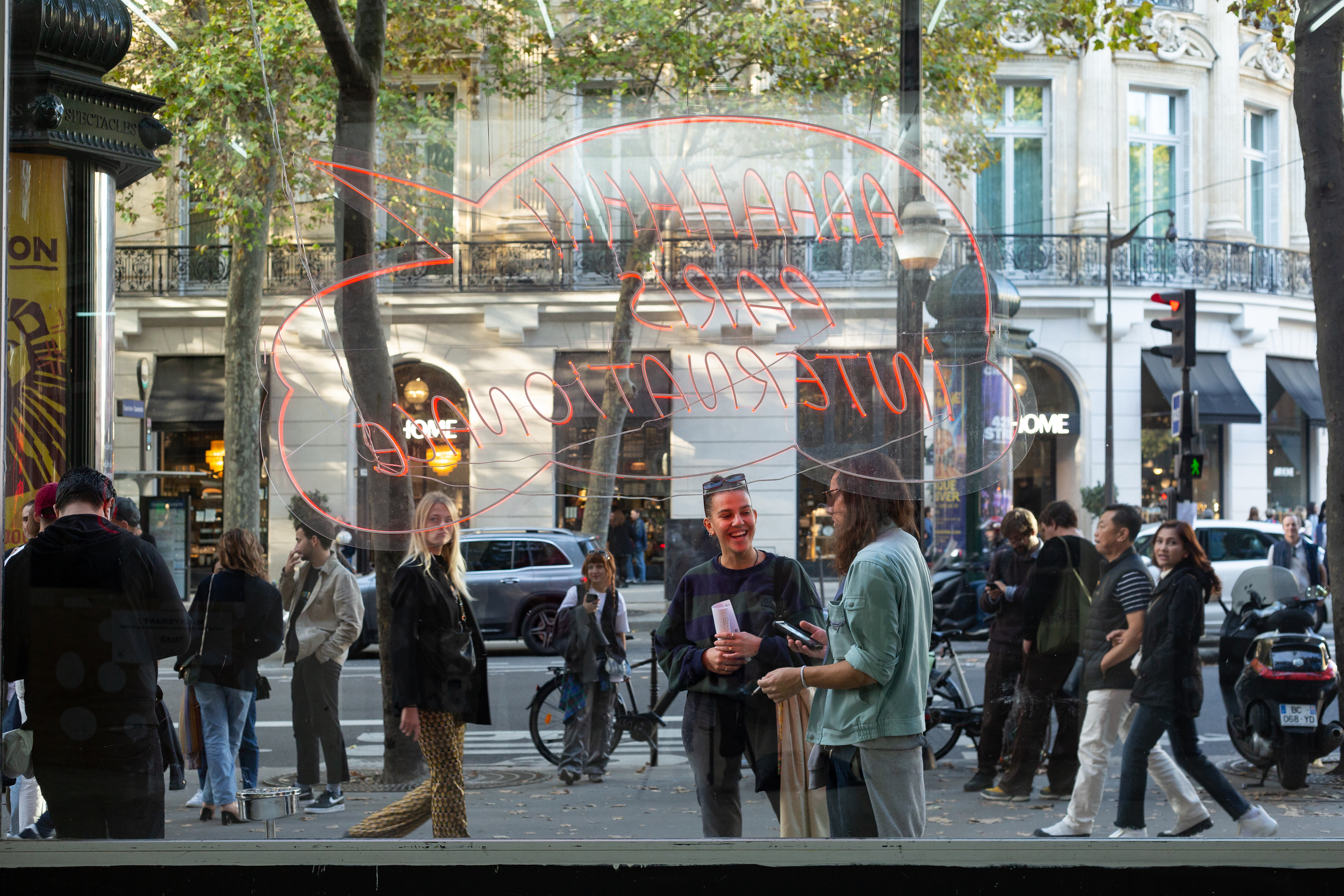
Paris Internationale is a collegial initiative established in 2015 as an innovative alternative to traditional art fairs to support a new generation of galleries. Over its nine editions, it has developed into a pivotal platform to promote the work of emerging artists and rediscover more established figures. Paris Internationale keeps its participation costs reasonable to encourage risk taking and to present its audience with a selection of artworks at the forefront of contemporary practices.
Founders: Axel Dibie & Alix Dionot-Morani - Galerie Crèvecoeur, Paris
Marie Lusa & Gregor Staiger - Galerie Gregor Staiger, Zurich
Nerina Ciaccia & Antoine Levi - Ciaccia Levi, Paris
For more info visit: parisinternationale.com
Galerie Gregor Staiger was founded by Gregor Staiger and Marie Lusa in 2010 with a focus on emerging Swiss and international contemporary art across a variety of media. The gallery hosts five to six exhibitions per year comprising solo presentations by represented artists, curated group shows, experimental projects with young emerging artists as well as performances.
For more info vist: galerie.gregorstaiger.com
ZURICH ART WEEKEND was founded in 2018 by Marie Lusa, Victor Gisler, Eva Presenhuber, Gregor Staiger and Scipio Schneider.
Next edition: ZURICH ART WEEKEND 9th Edition, JUNE 12–14, 2026
For more info visit: zurichartweekend.com
Since 2104, Marie Lusa is professor at ECAL, école cantonale d'art de Lausanne, currently in the department Master of Type Design.
For more info visit: ecal.ch
Since 2020, Marie Lusa is a guest lecturer in the Bachelor Fine Arts Departement of ZHDK, Zurich University of the Arts.
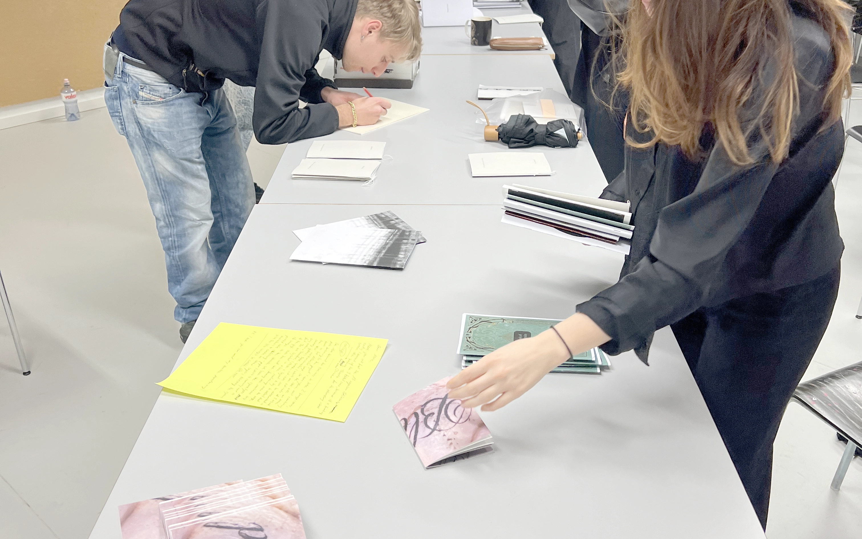
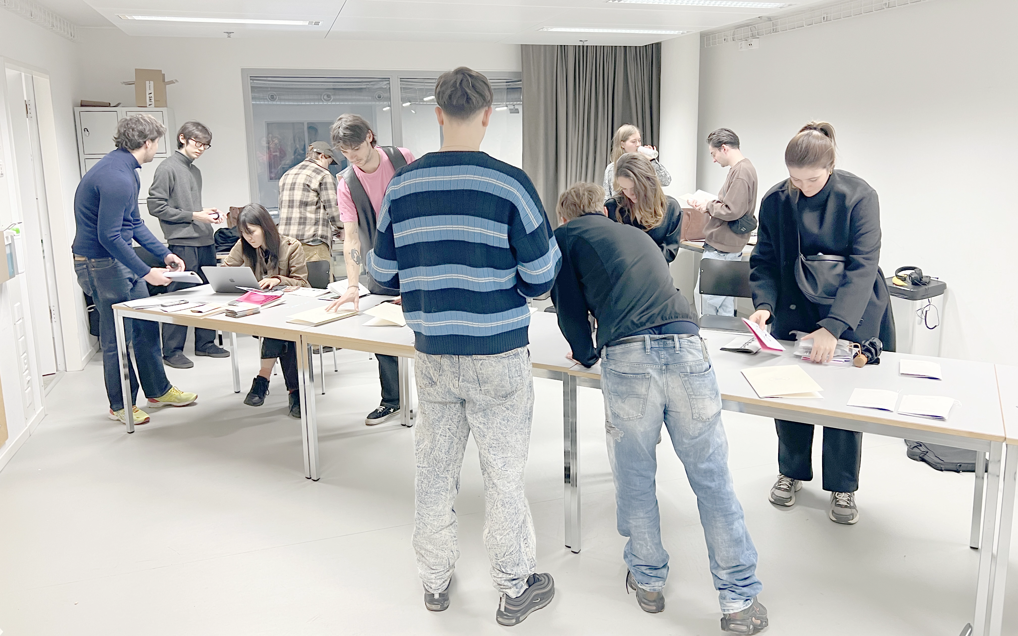
Since 2019, workshop at The University of Fine Arts, Zurich, Departement Fine Arts
Although society is undergoing a transition from the physical to the digital, the printed book still enjoys great popularity in the arts. The interdisciplinary workshop approach the medium book and questions of publishing in different ways. Typological questions (functionality, task, impression, use, communication) will be discussed as well as practical (how is a book structured, how is it created) and analytical (how can its concept be expanded, etc.).
Marie Lusa works as art director and graphic designer. She is one of the most important graphic designers in Switzerland and has received several awards. The publications she has designed are often created in close collaboration with the artists themselves. In addition to her work as a graphic artist, she is also co-founder of the Paris Internationale art platform and teaches at the ECAL
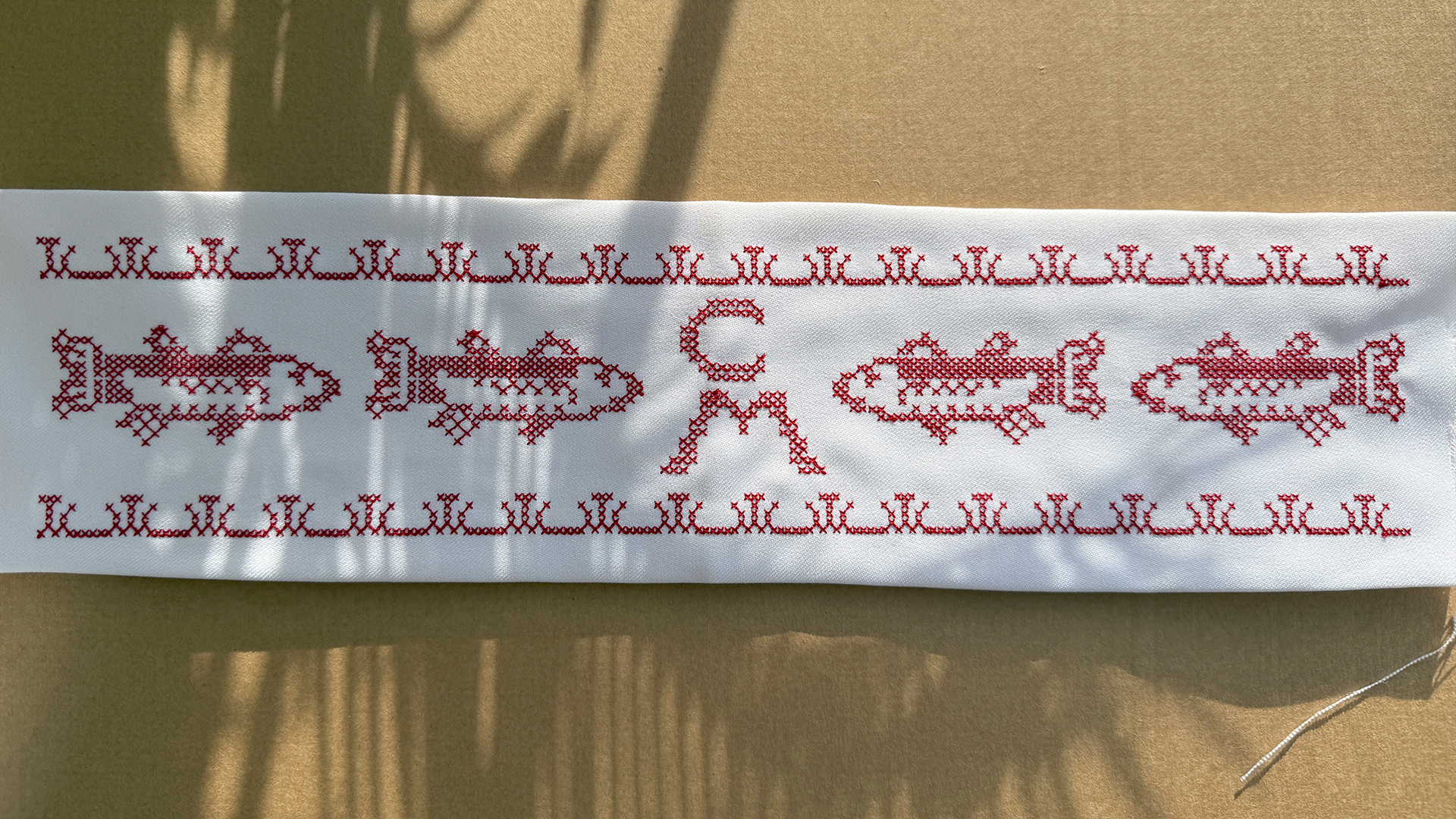
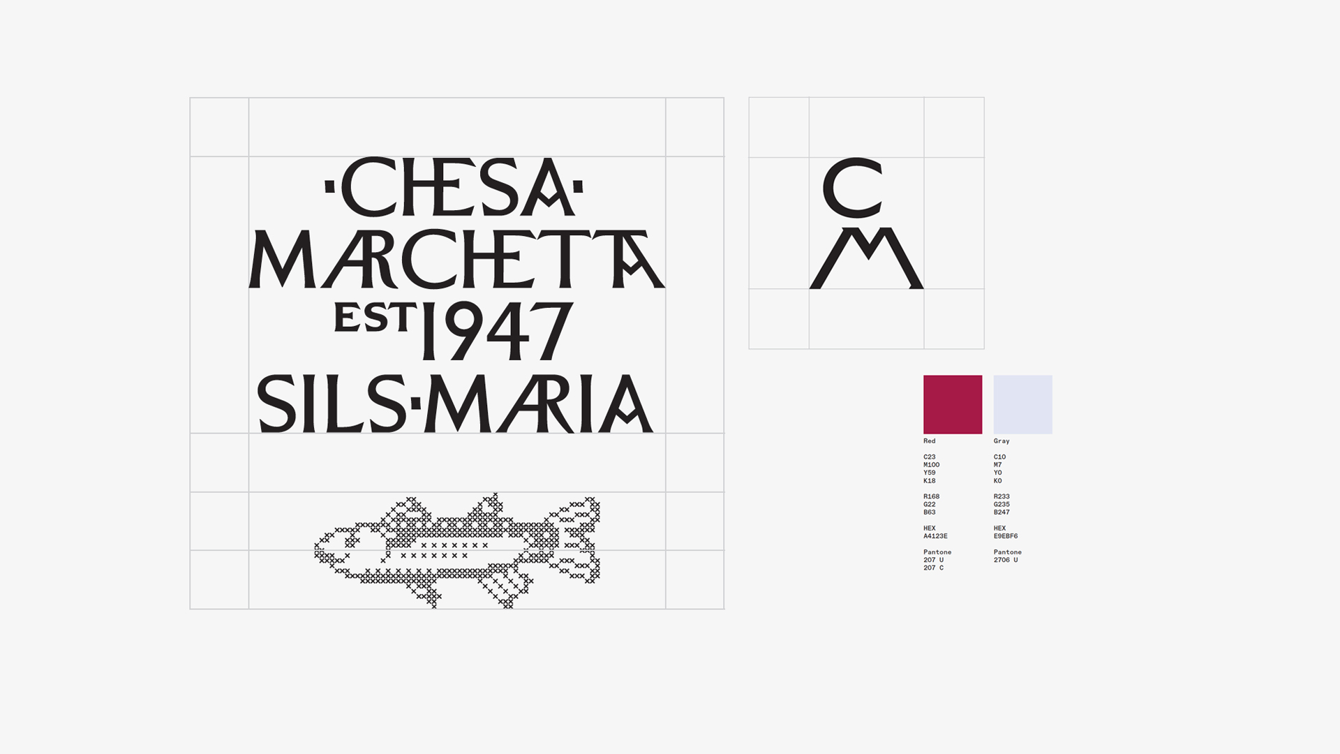
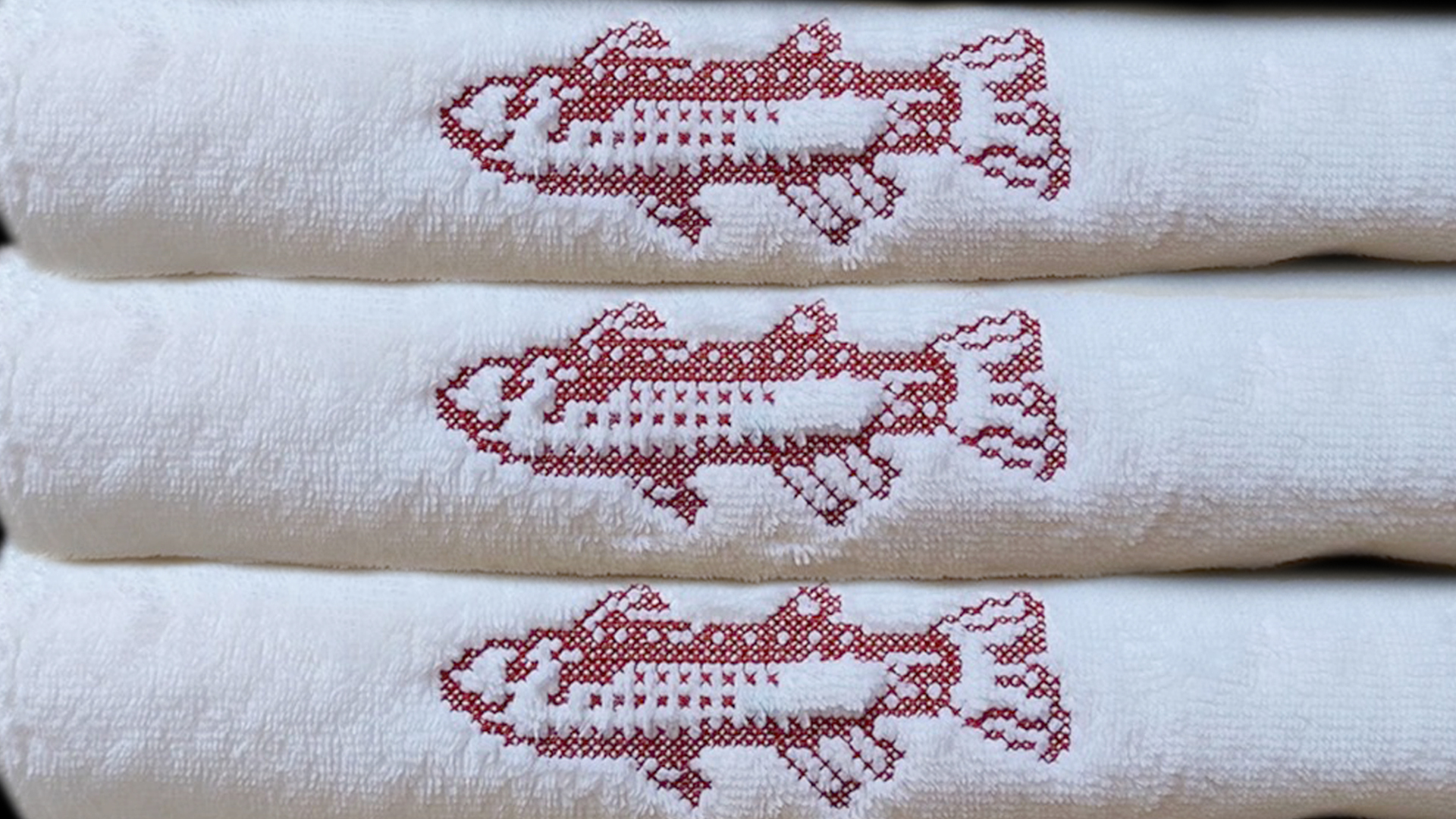
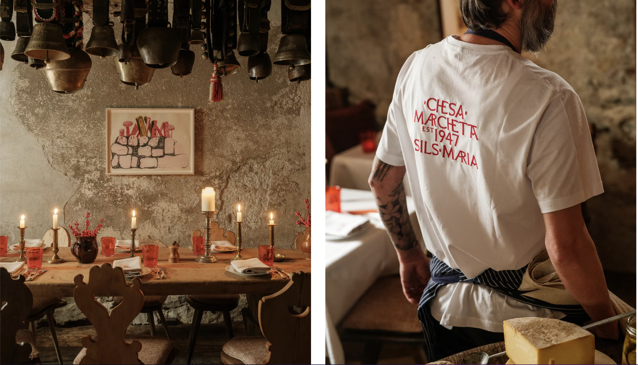
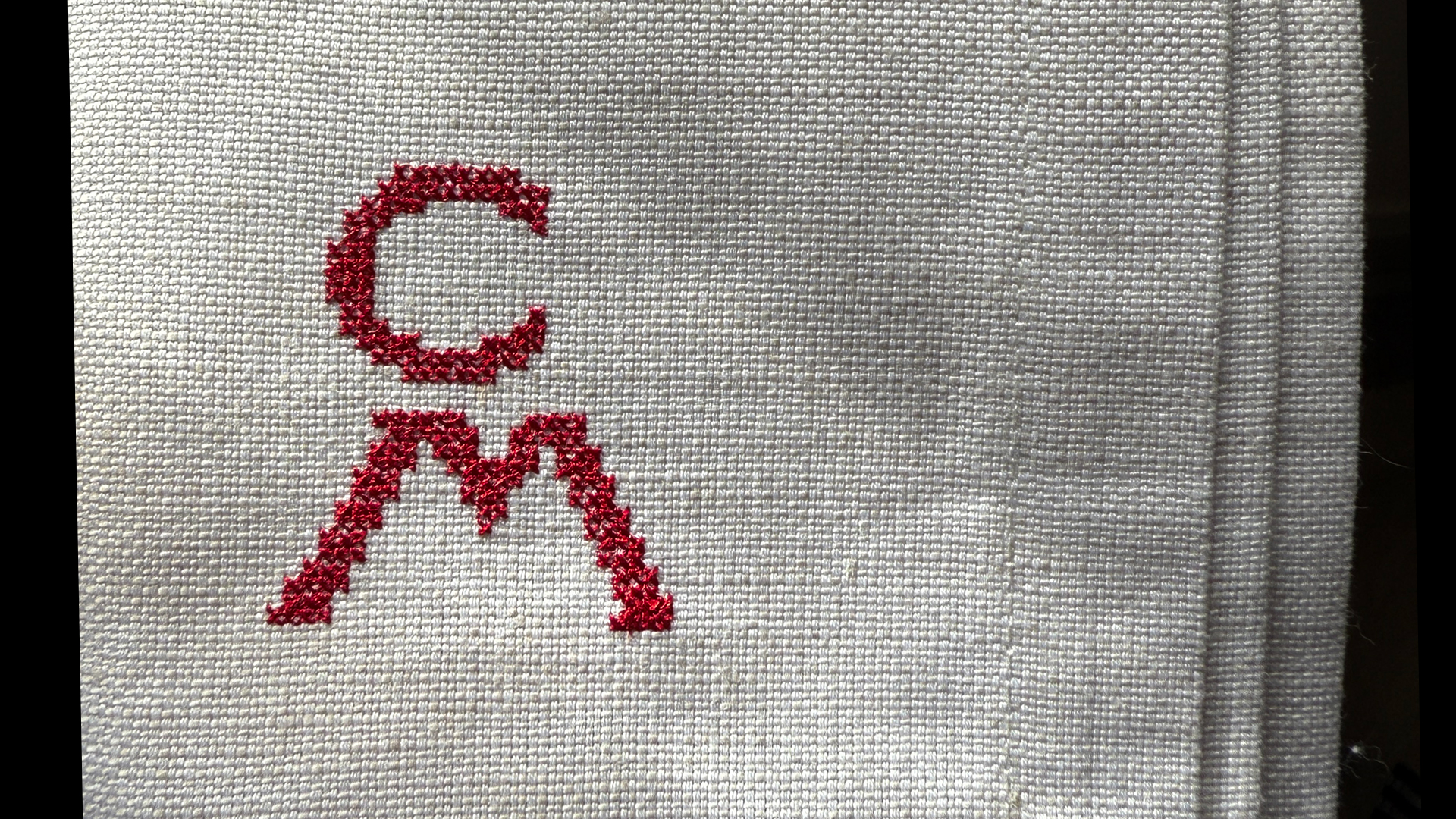
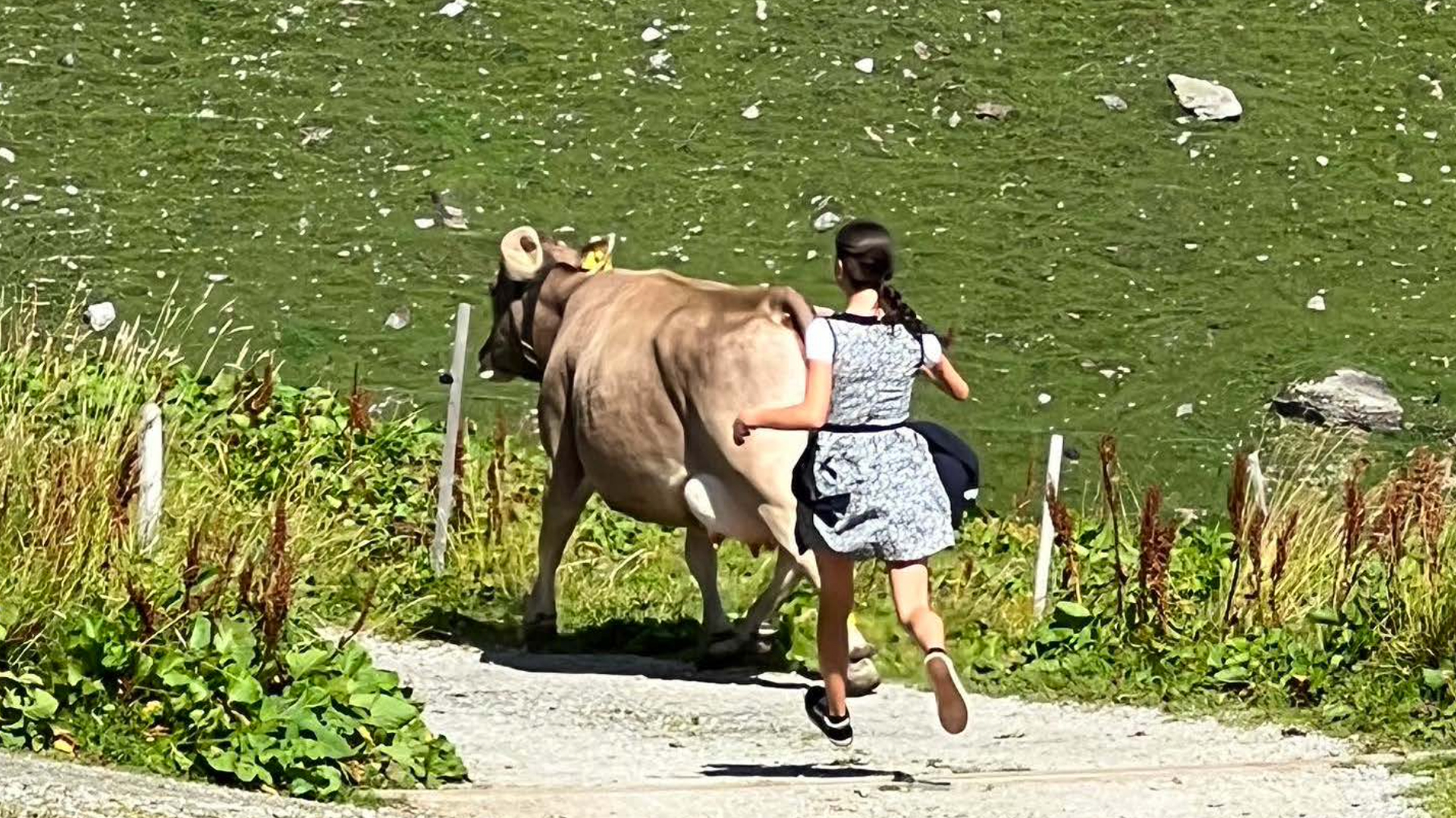
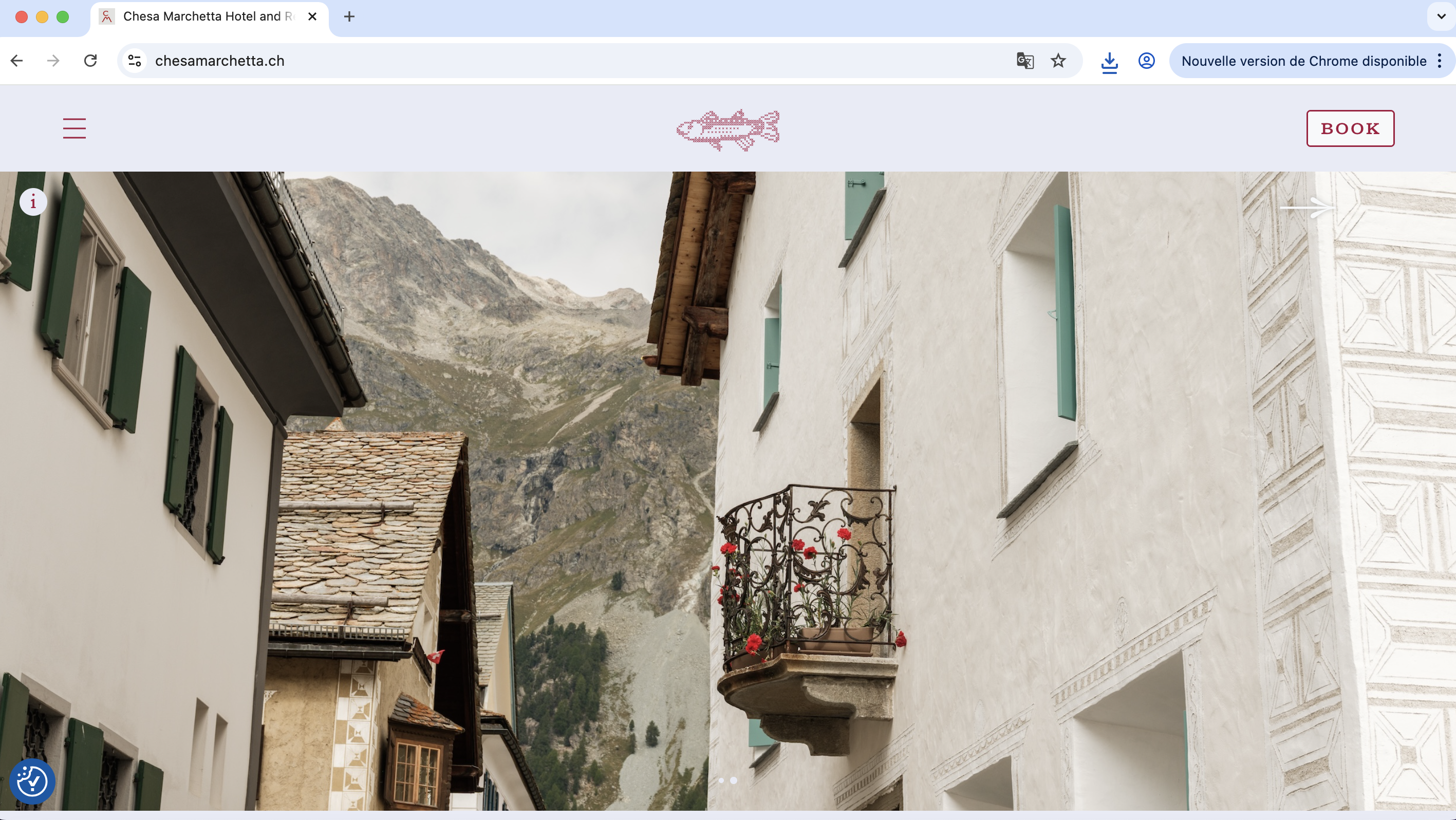
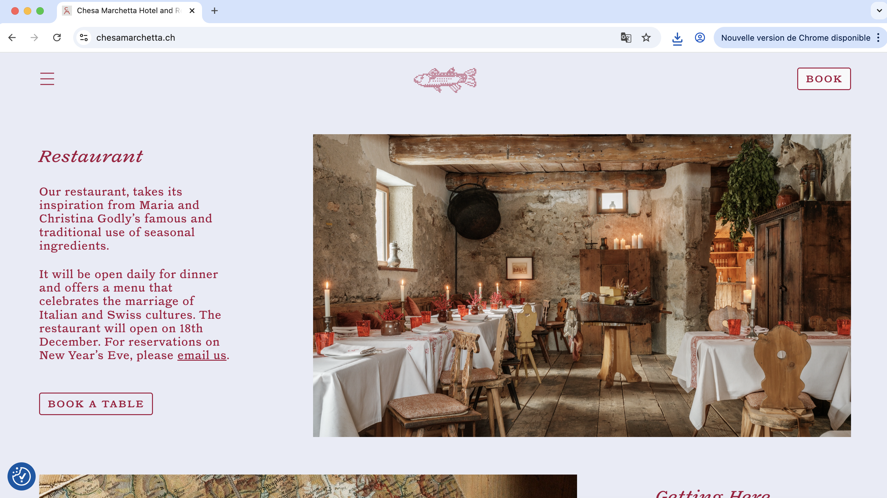
Visual Identity for CHESA MARCHETTA, Sils Maria, 2025
https://chesamarchetta.ch / H&W CM
Press: Financial Time HTSI Travel
Website programming by Computed By


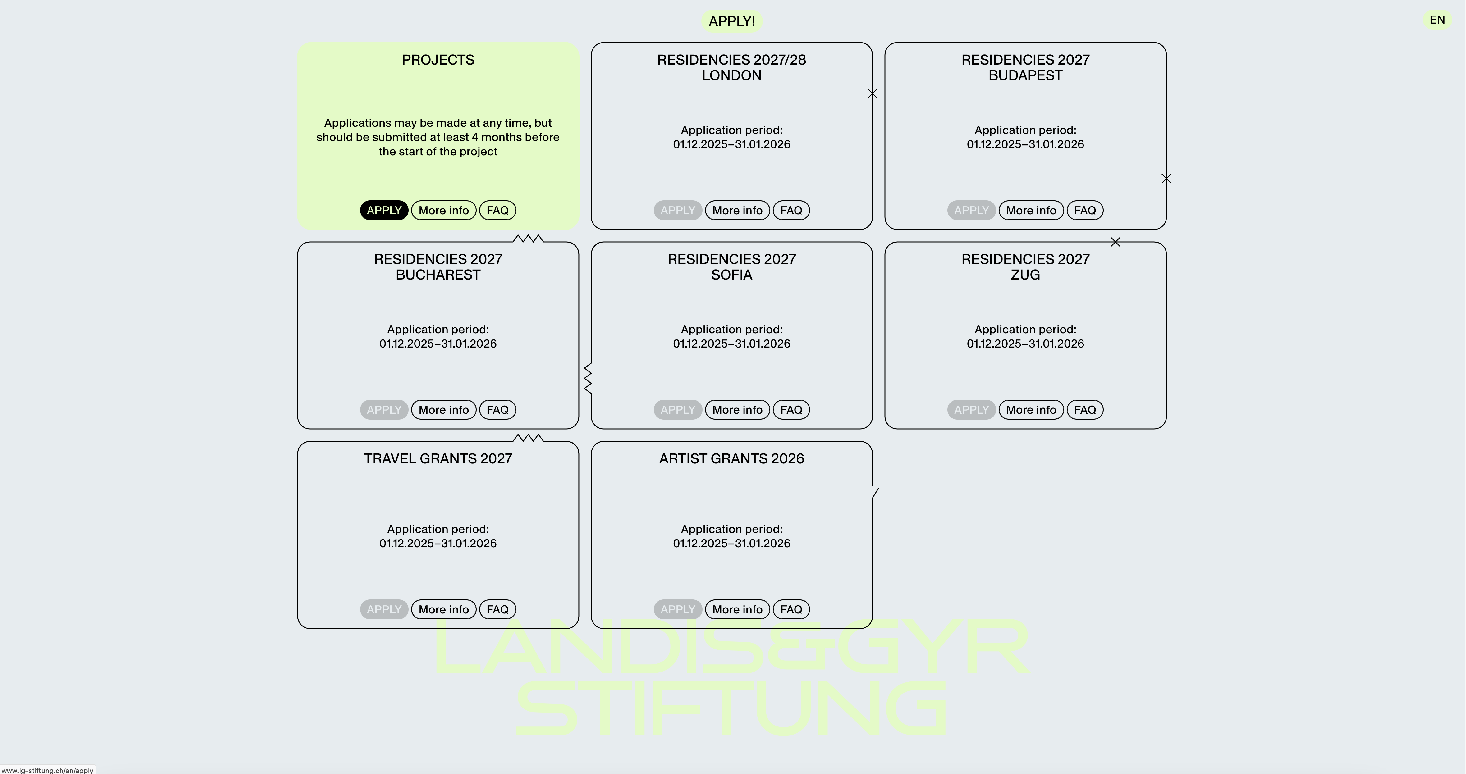
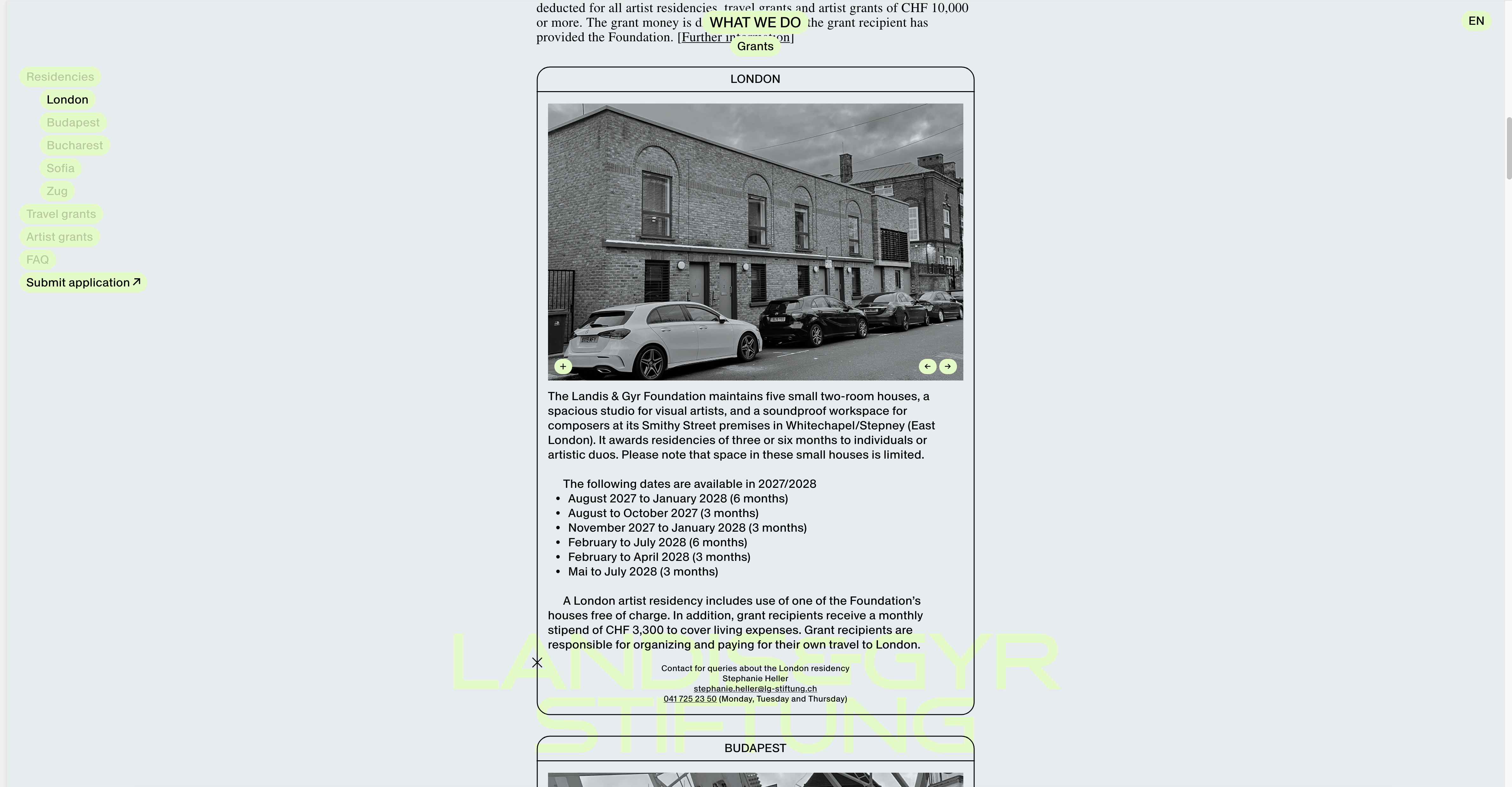
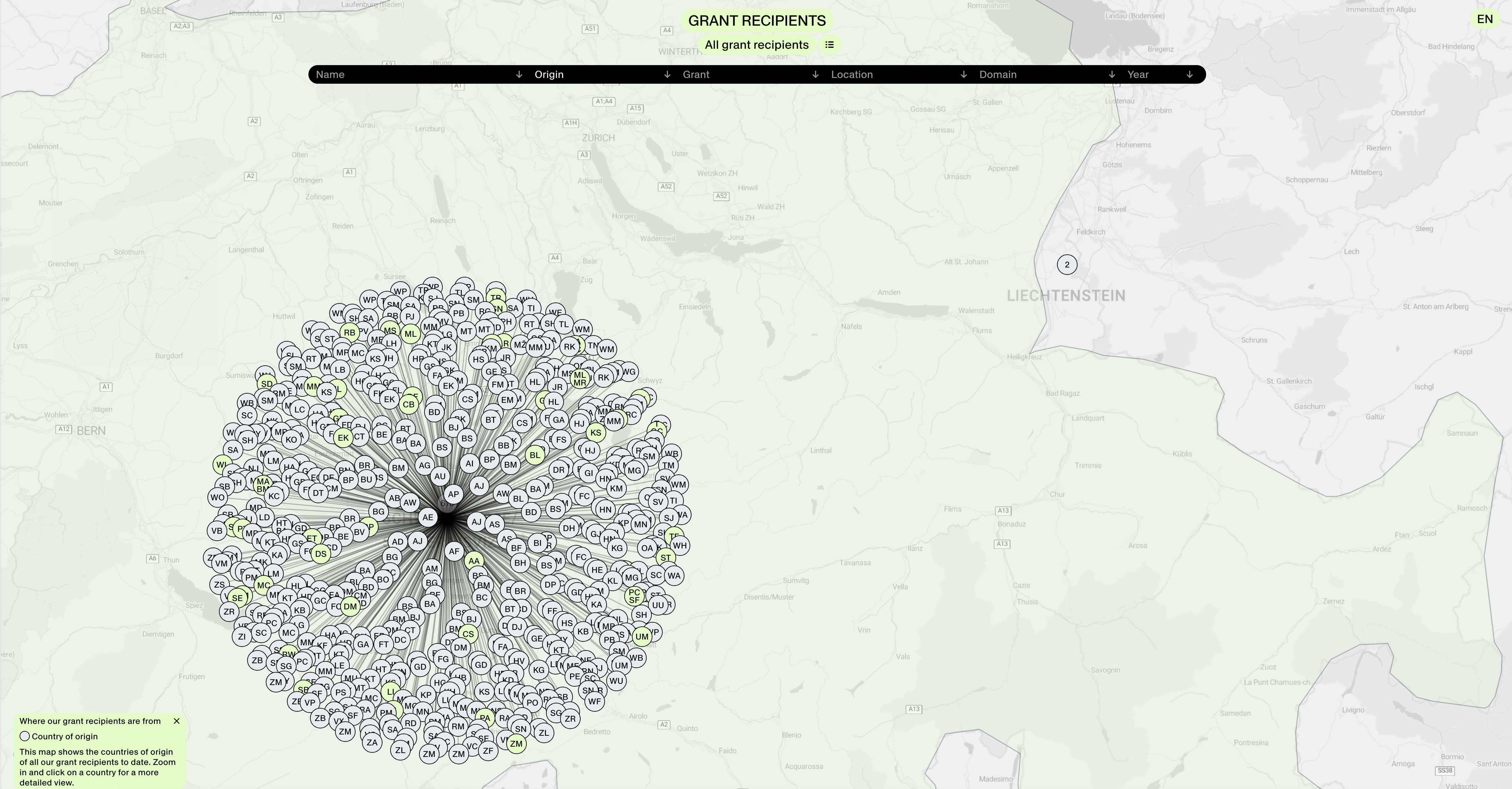
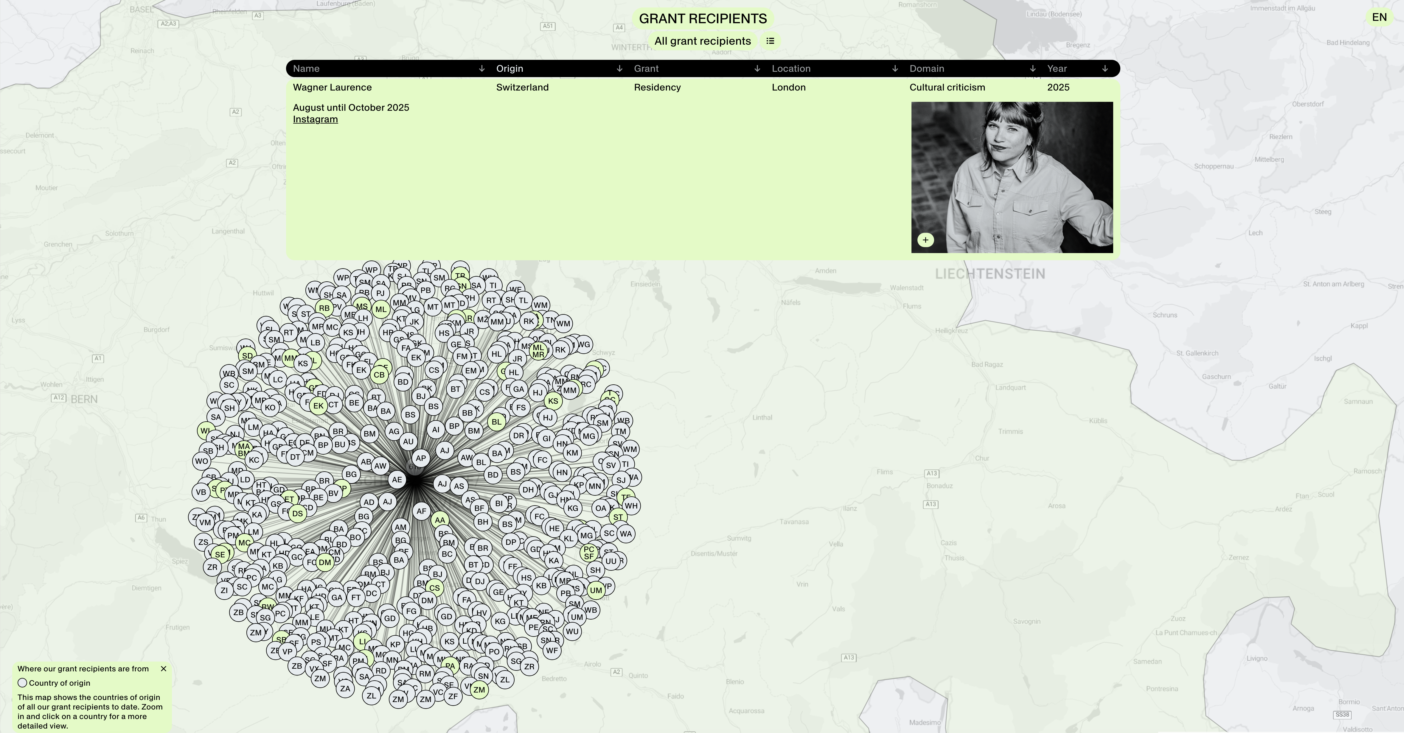
Visual Communication & Identity
Landis & Gyr Stiftung, 2024–ongoing
Website programming: Computed By
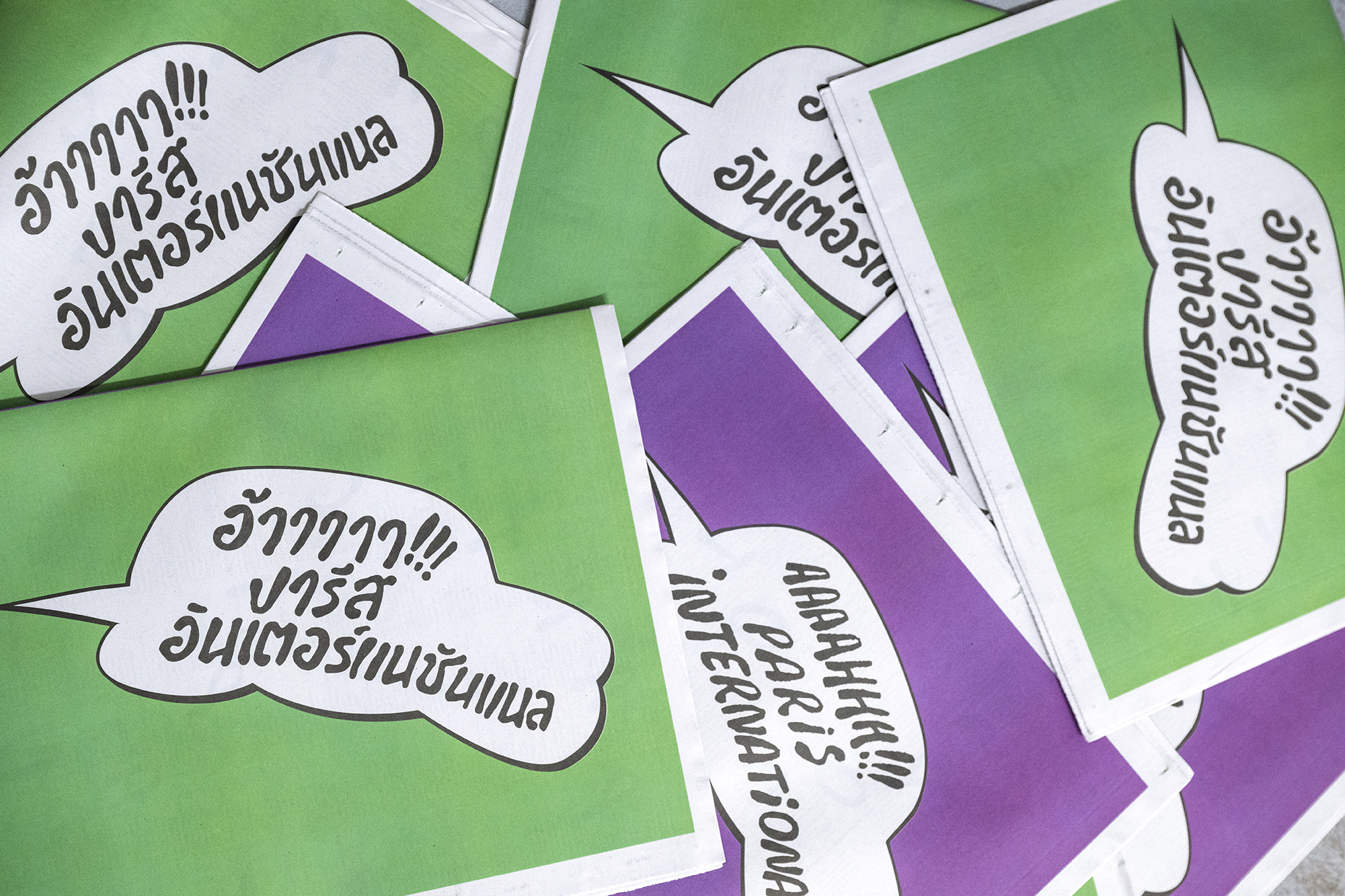
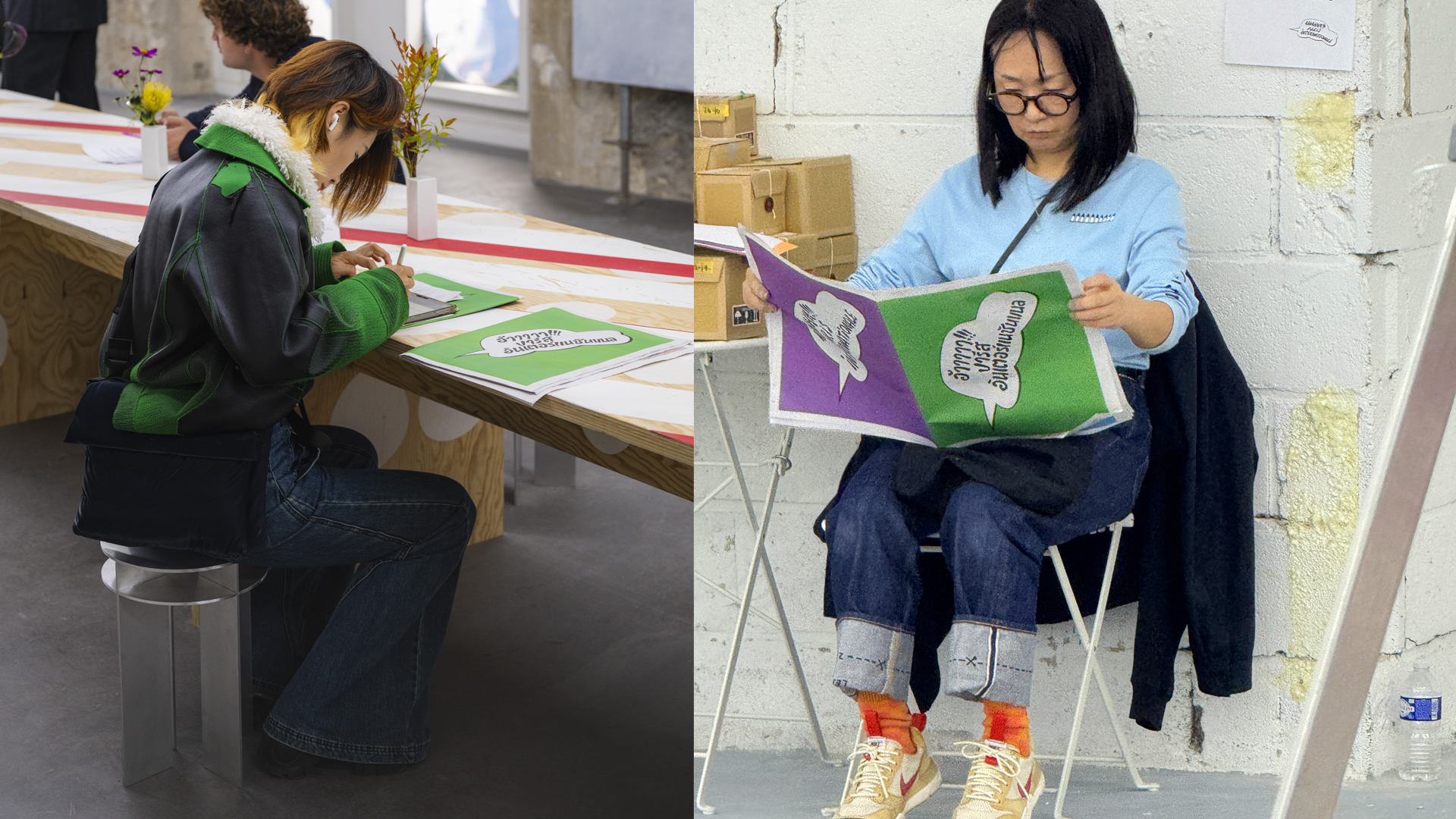
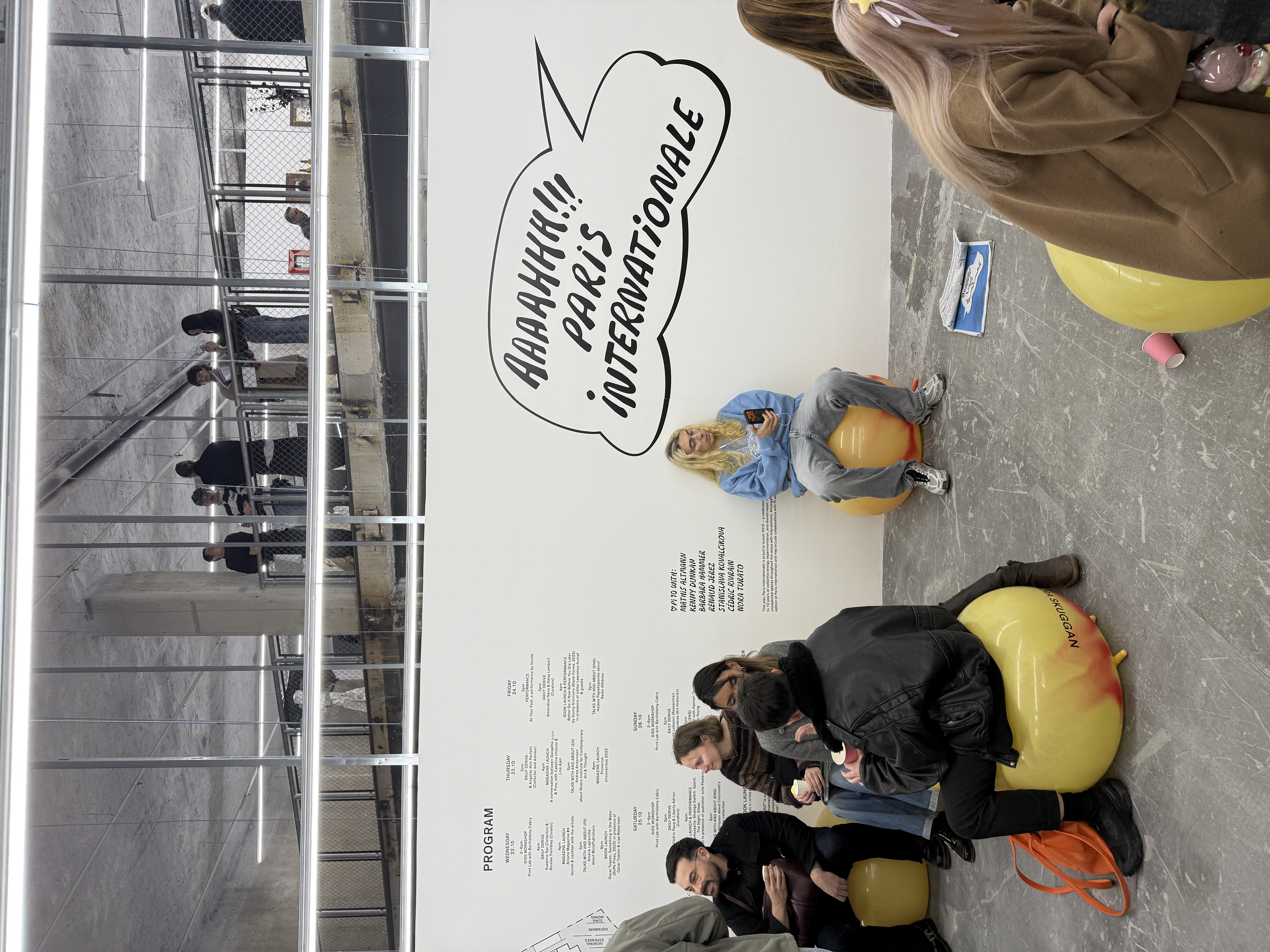
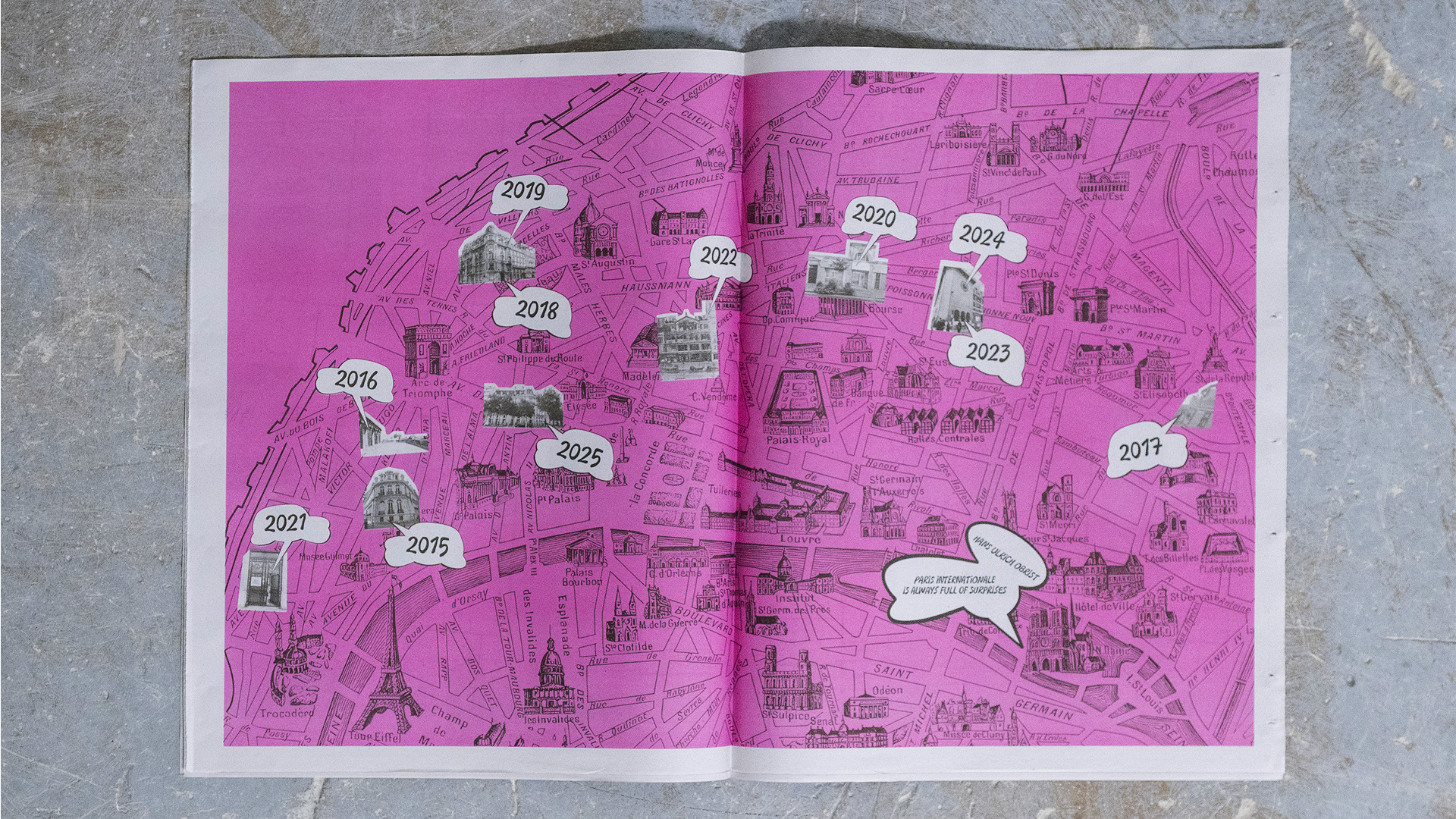
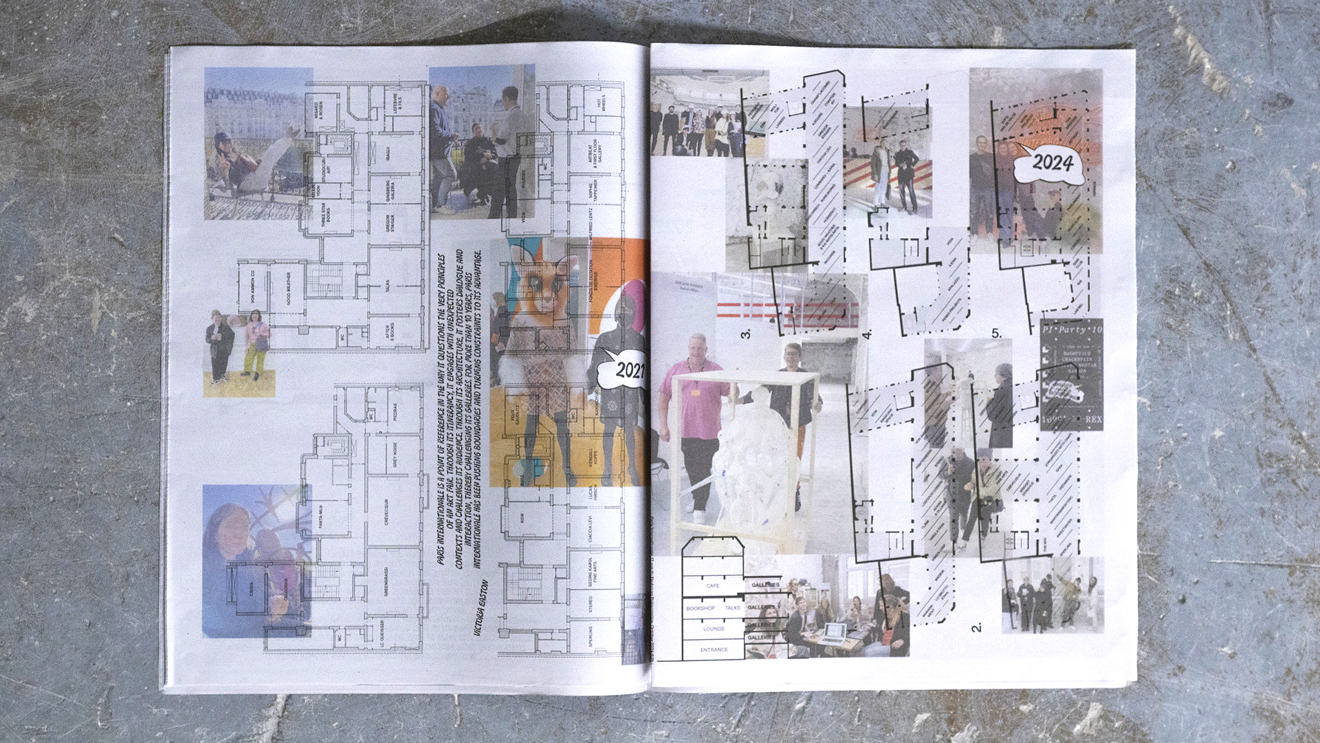
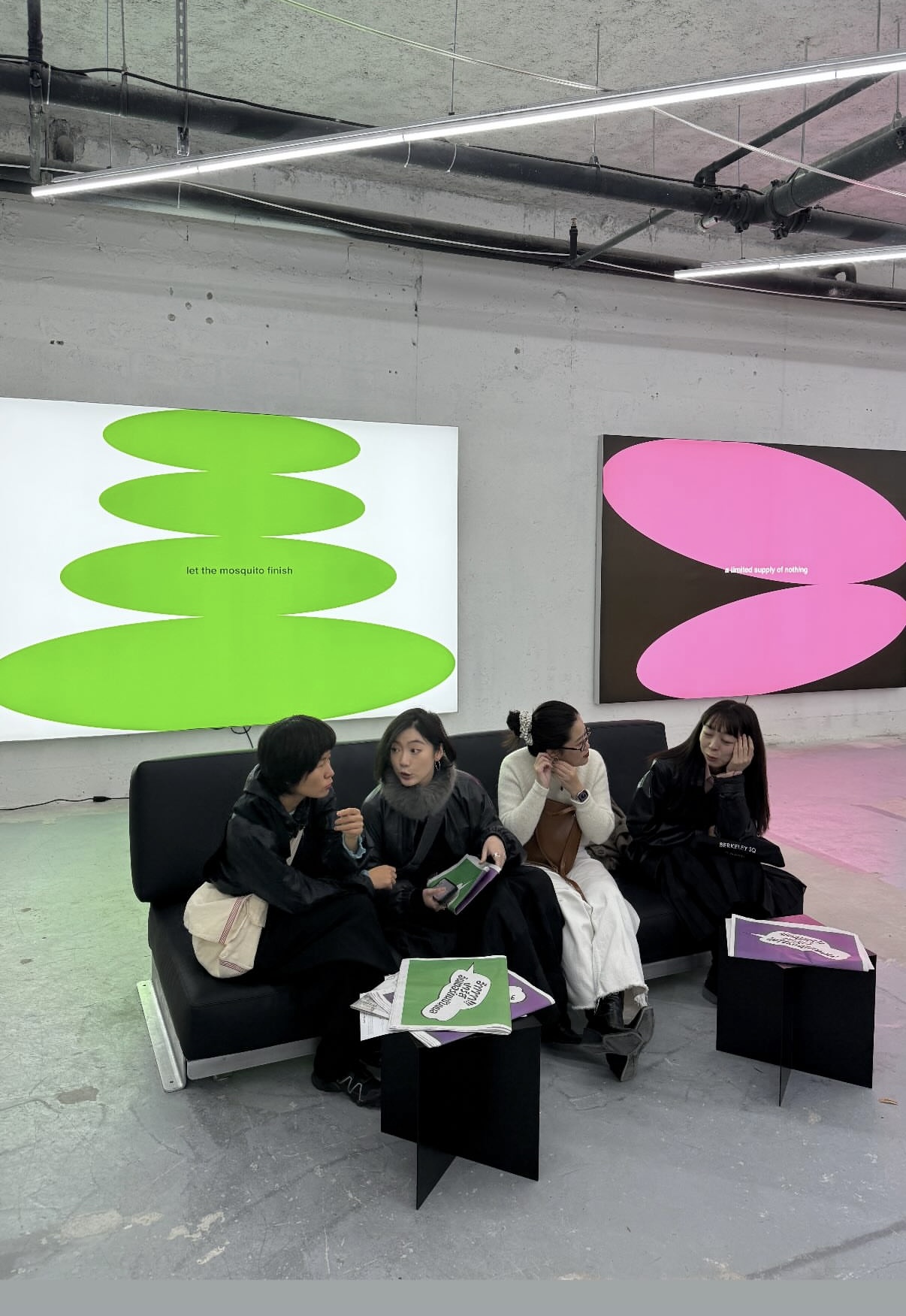
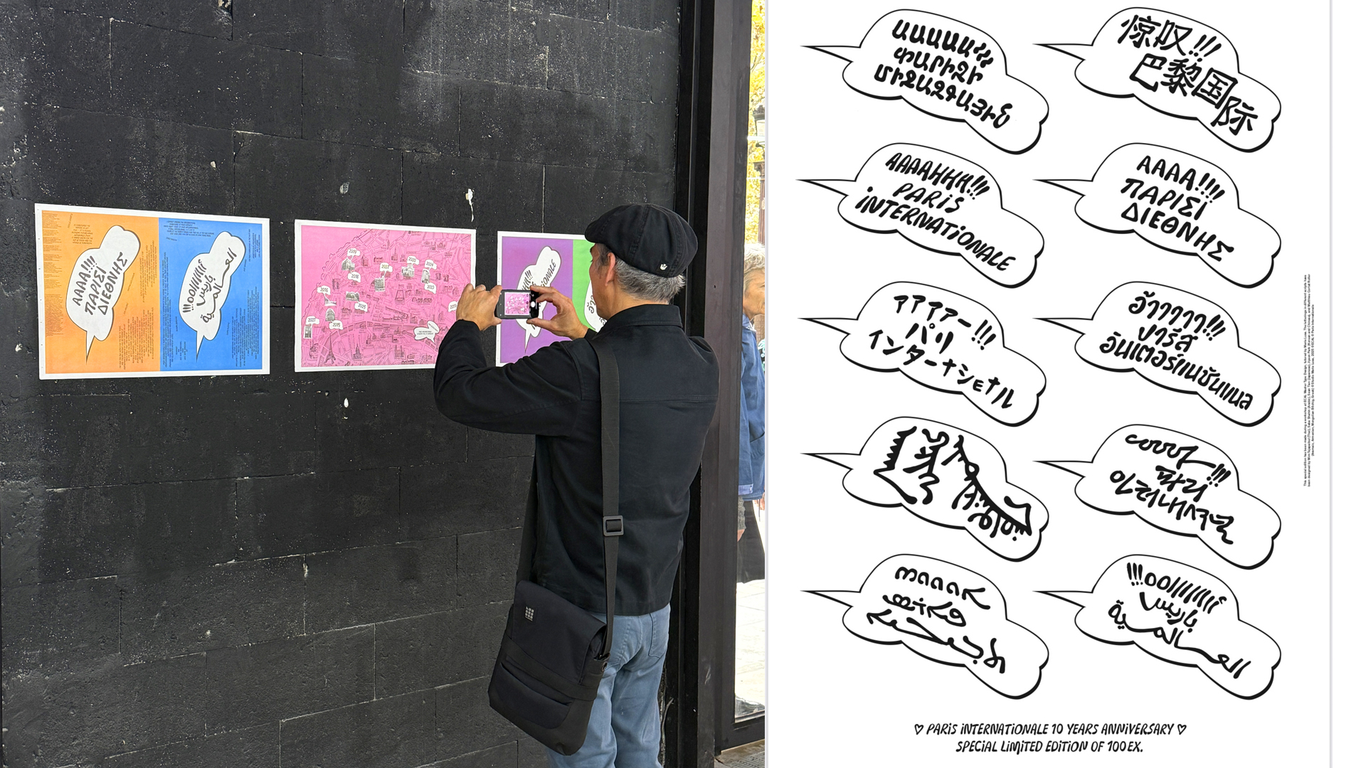


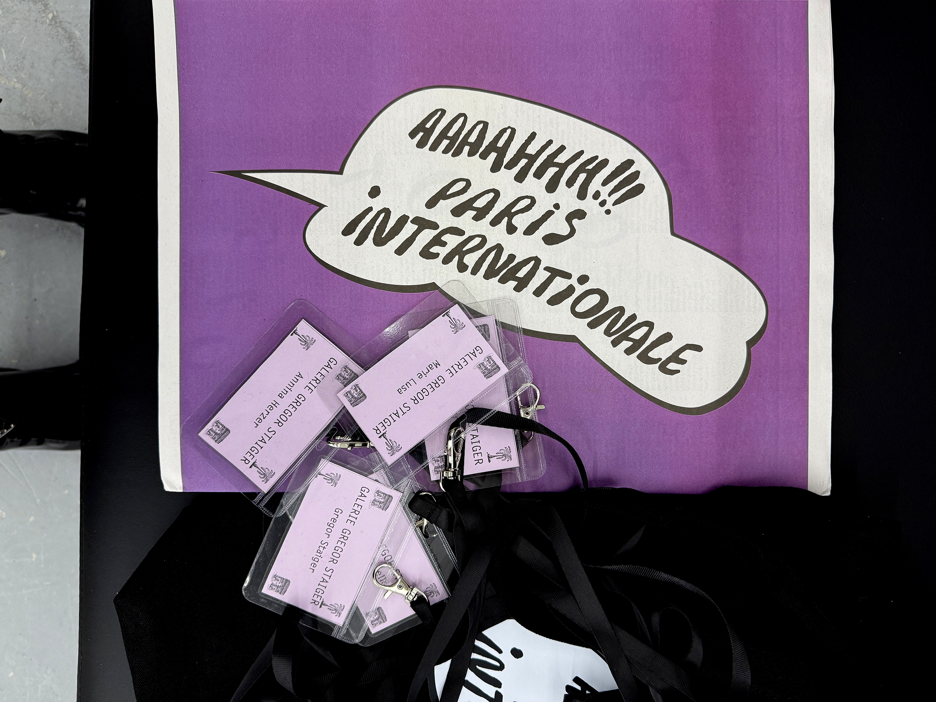
Visual Identity & editorial for the 10th edition in October 2025.
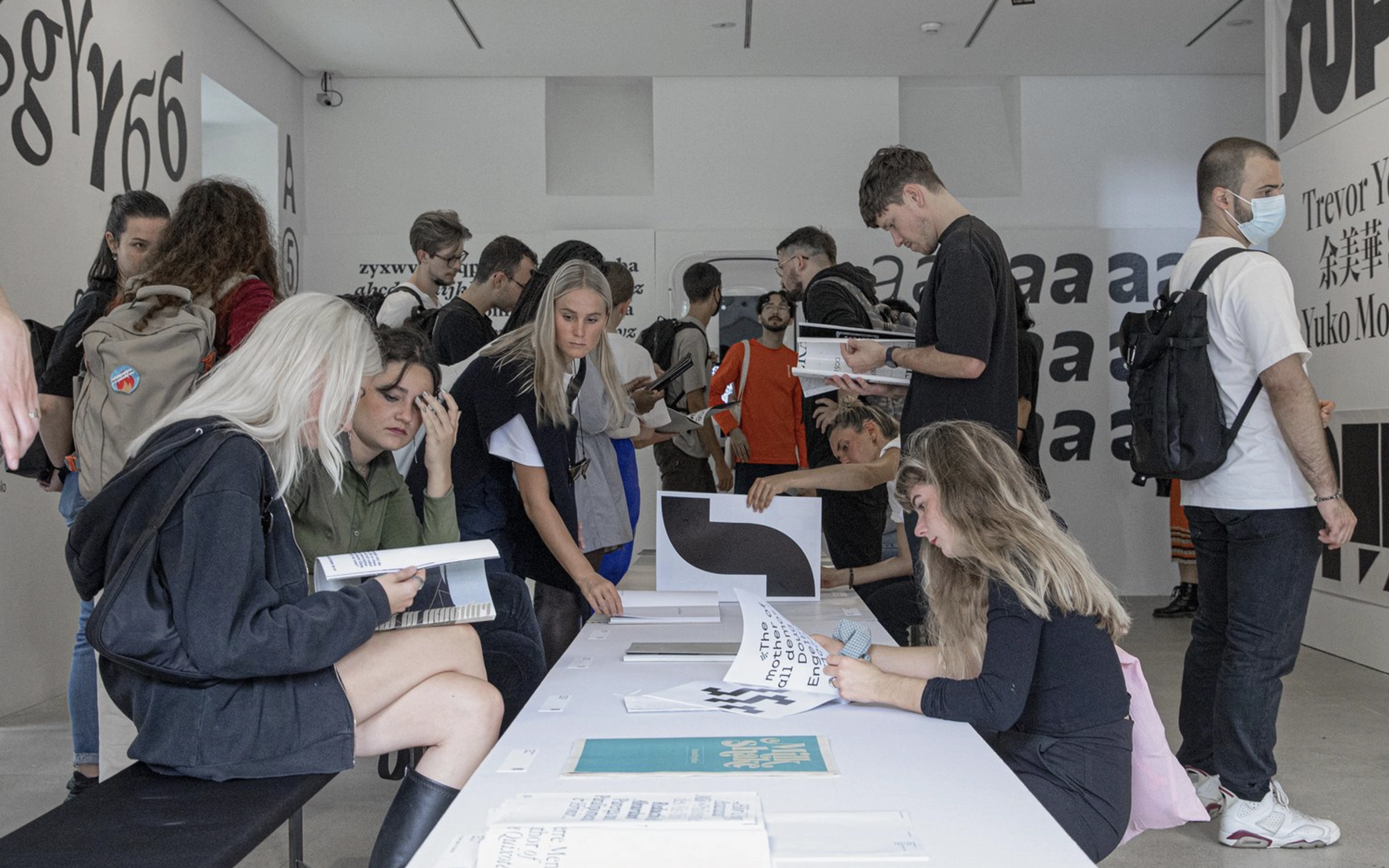
Paris Internationale 10 years publication has been made during a workshop session of at ECAL Master Type Design, tutored by Marie Lusa. Participants: Chae Ahn, Saliù Baldé, Claudio Bolzonello, Elena Calò, Meryem Fekhari, Julian Jaffé, Phil Kim, Dohee Lee, Jiyeon Park, Diego Steiner, Sean Tien, Yousef Saba and Friederike Wagner. The letterings in different scripts have been designed by Mim Tejapaibul (Thai), Saba Yousef (Arabic), Sean Tien (Japanese), Jiyeon Park (Korean and Chinese), and Matthieu Cortat Roller (Aramaic, Armenian, Mongolian Bitchig, Greek). All the display typefaces used in this publication have been designed by the students. The font used for smaller texts is Parabole, designed by Dávid Molnár and updated by Chandra Sperle.
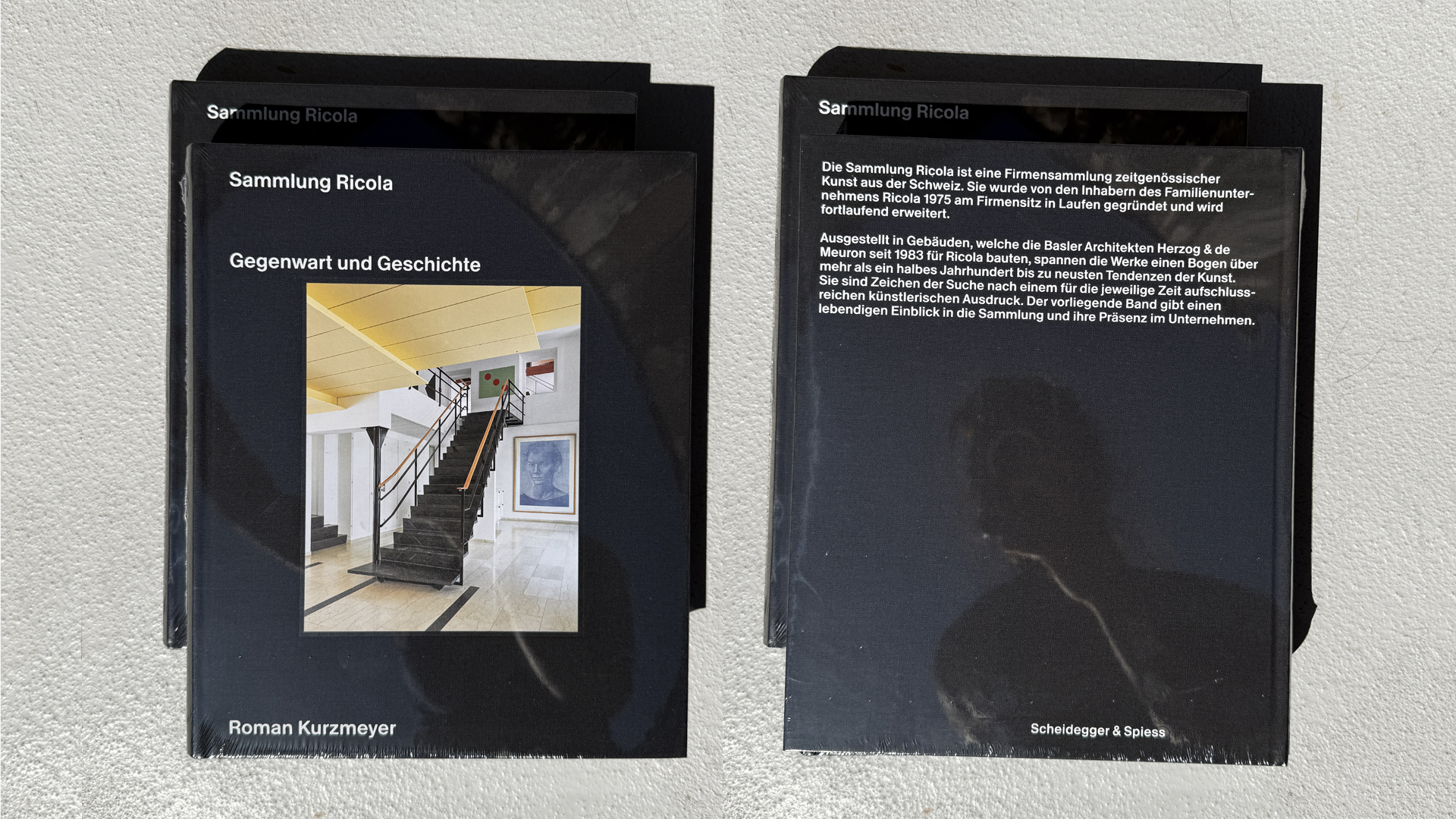
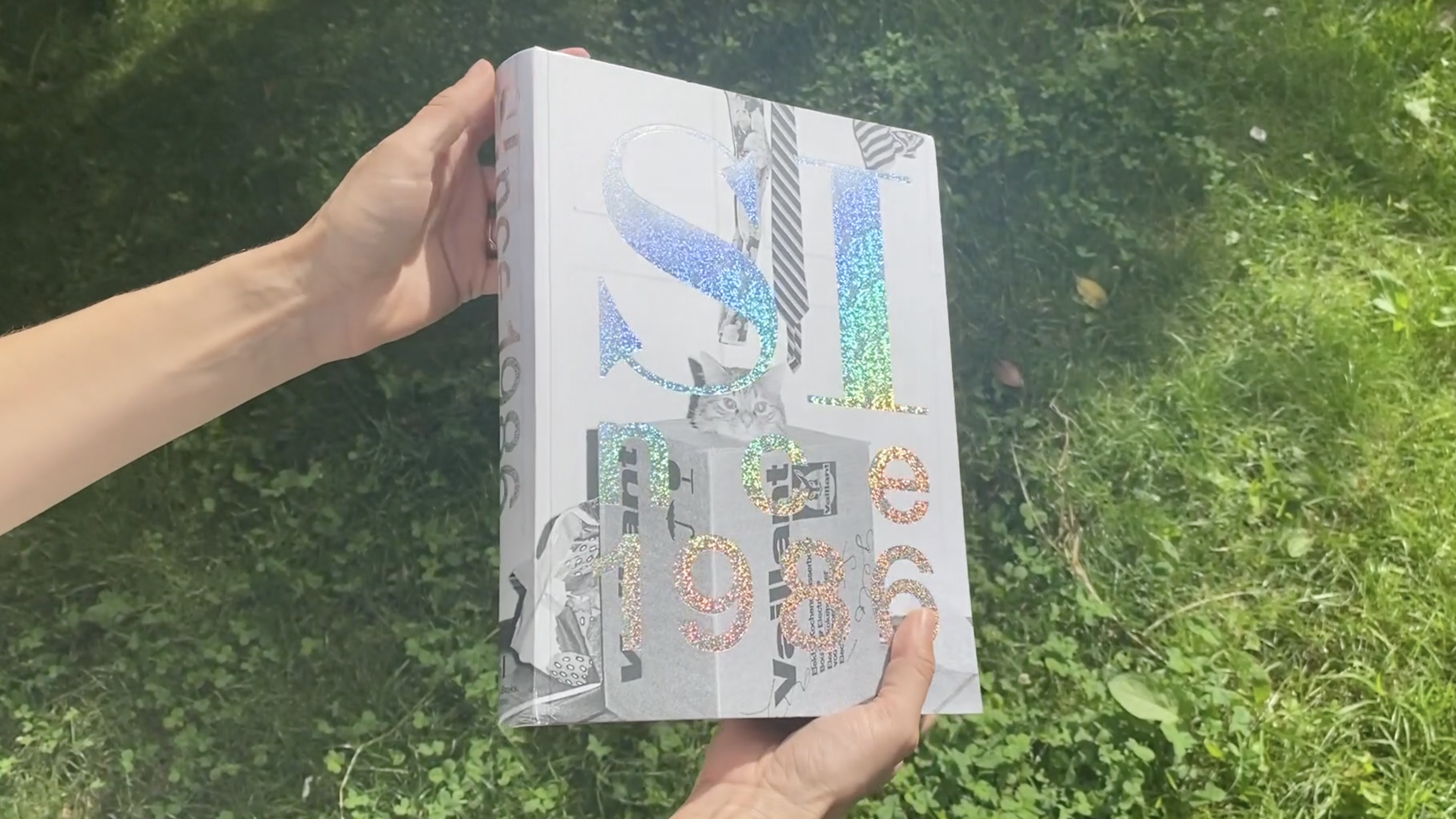
Book design: Sammlung Ricola. Gegenwart und Geschichte — Roman Kurzmeyer
2025, Hardback
360 pages, 266 color and 63 b/w illustrations
22 x 27 cm, ISBN 978-3-03942-246-3
Ricola is a Swiss global brand, famous for its herbal candies, based in the town of Laufen, near Basel. Since 1975, the shareholders of the still family-owned business have been building the Ricola Collection systematically with a focus on Swiss art. Open to the public and on display in buildings that celebrated Swiss architects Herzog & de Meuron have designed for Ricola since 1983, the collection spans more than half a century and represents the latest trends in contemporary art. This lavishly illustrated English-language book offers a lively insight into the collection, its history and presence in Ricola’s corporate life, and places it within the Swiss art scene. Concise comments on a large selection of individual works round off this volume.
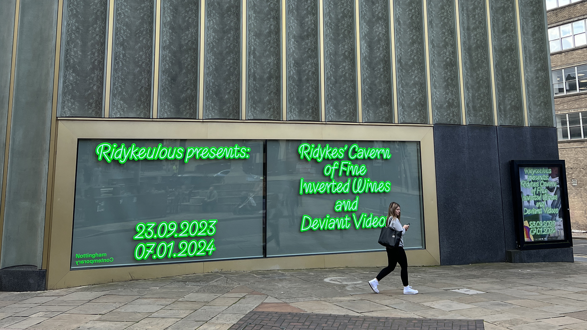
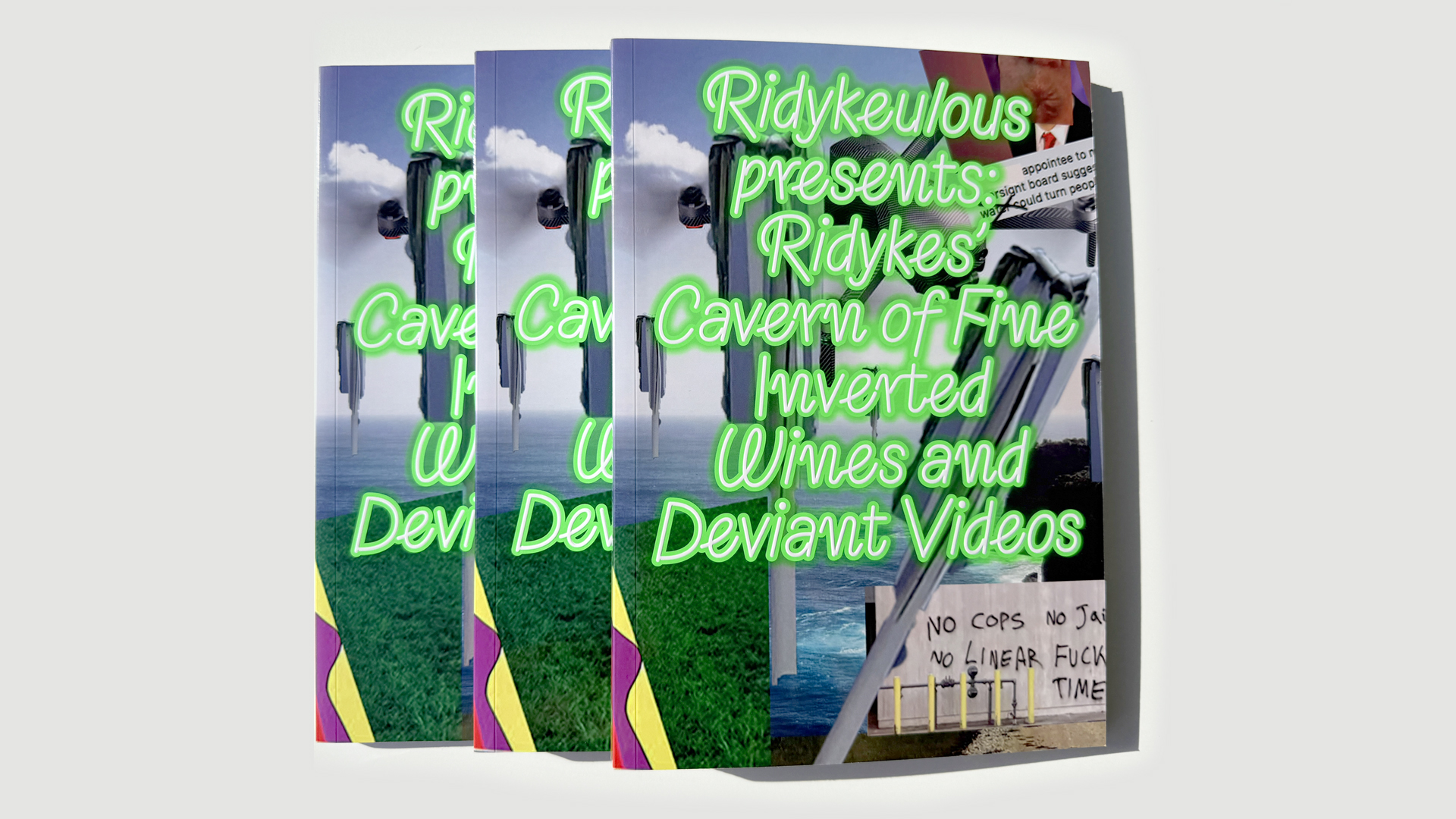
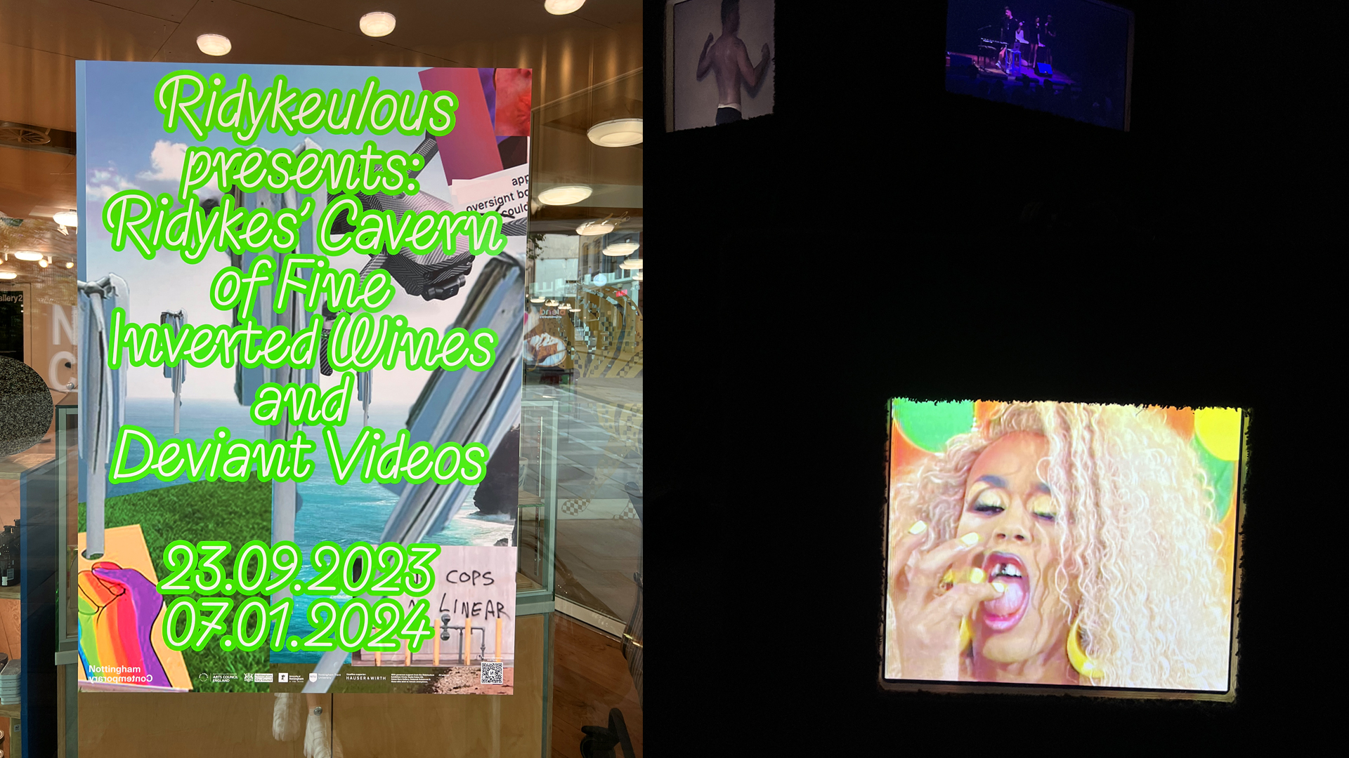
Book design & identity for Nottingham Contemporary
Ridykeulous (Nicole Eisenman & A.L. Steiner, with Sam Roeck): Ridykes’ Cavern of Fine Inverted Wines and Deviant Videos
"We like our curation like our sexuality – ambiguous"
– Ridykeulous
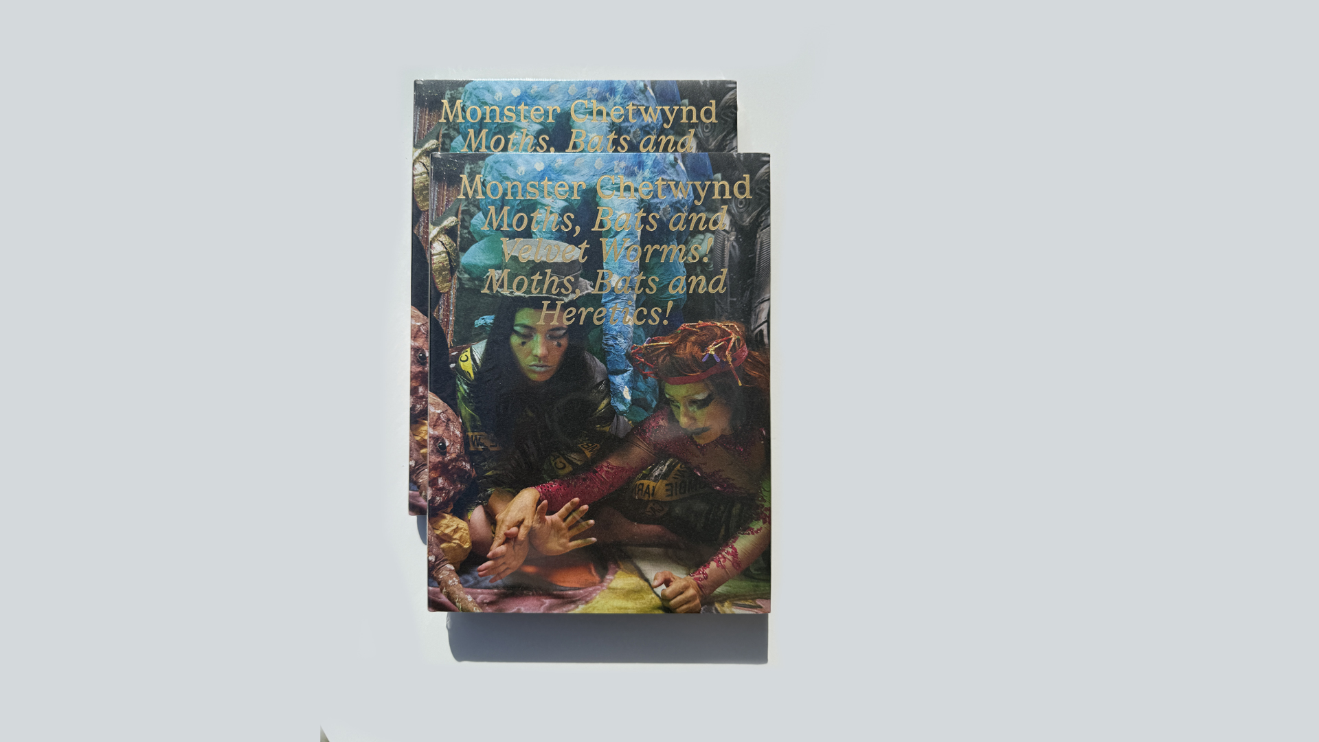
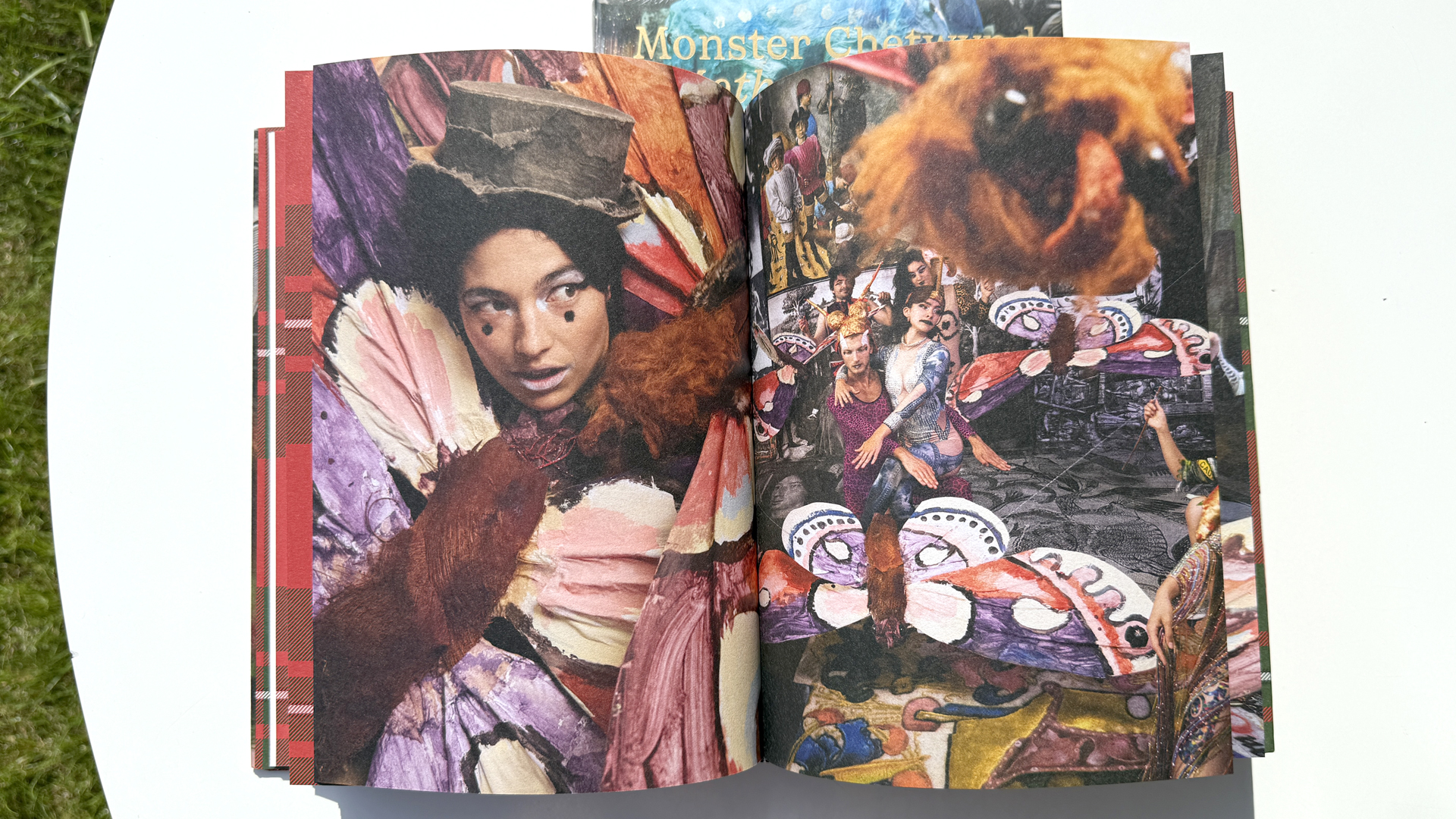
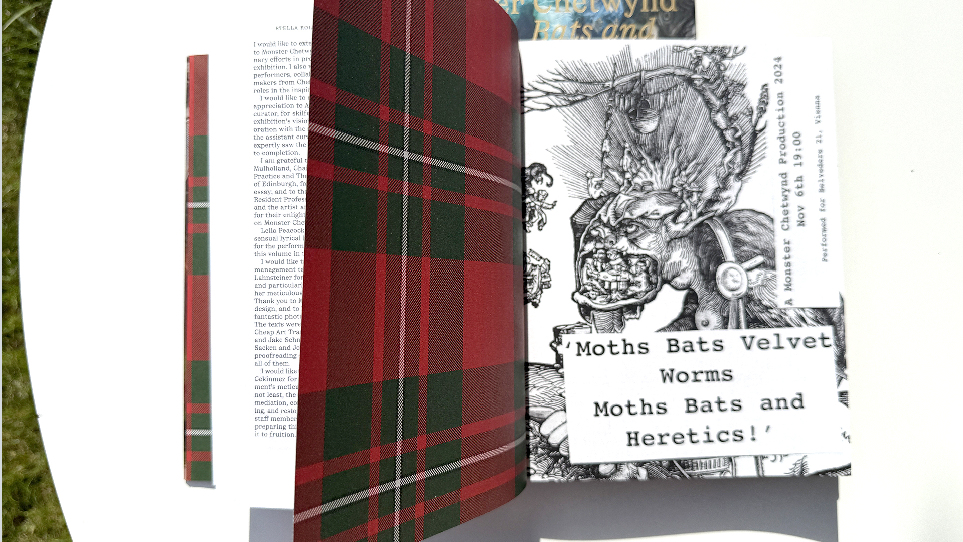
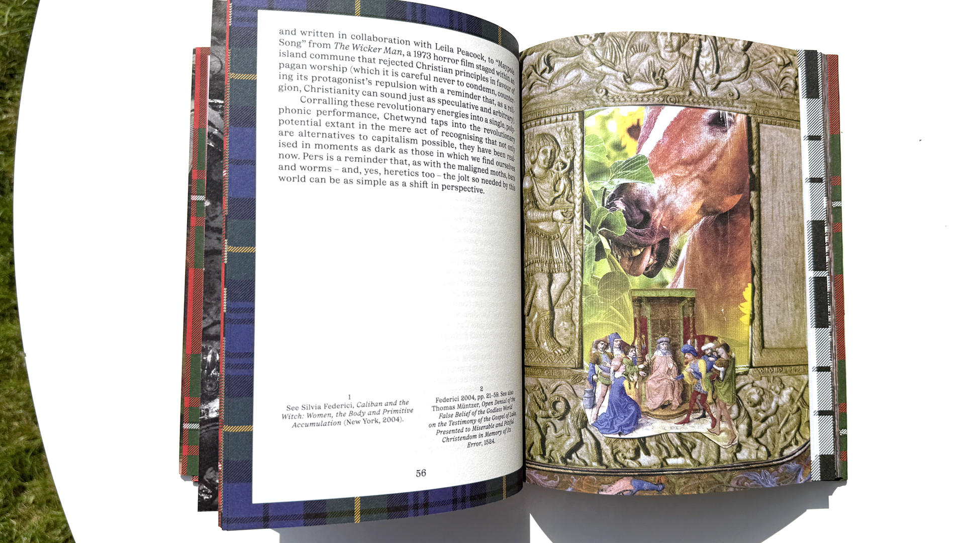
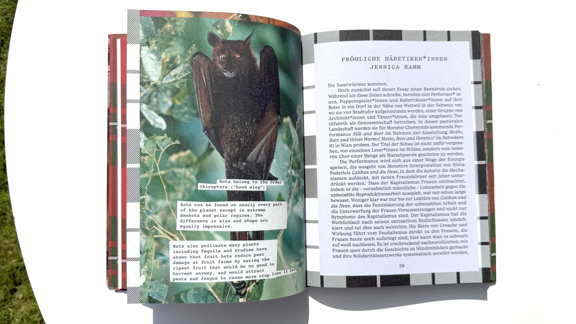
Book design for Belvedere Vienna
Monster Chetwynd: Moths, Bats and Velvet Worms! Moths, Bats and Heretics!
With texts by: Stella Rollig, Axel Köhne; authors: Axel Köhne, Neil Mulholland, Jessica Ramm, Stella Rollig, Kate Sutton
2024, Verlag der Buchhandlung Walther und Franz König
136 pages, 17 x 23 cm
ISBN: 978-3-7533-0748-0 (German, English)
Monster Chetwynd’s Moths, Bats and Velvet Worms! Moths, Bats and Heretics! is a lyrical, site-specific exhibition at Belvedere 21, activated and animated by performers and the audience alike. Monster Chetwynd is known for a multifaceted artistic practice that claims a radical artistic freedom and transcends genre boundaries. With collages, objects, installations, films, paintings, and, above all, absurdly humorous polyphonic performances, Chetwynd occupies exhibition spaces around the world.
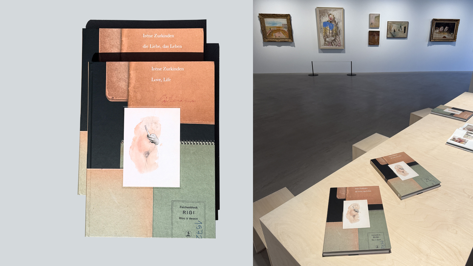
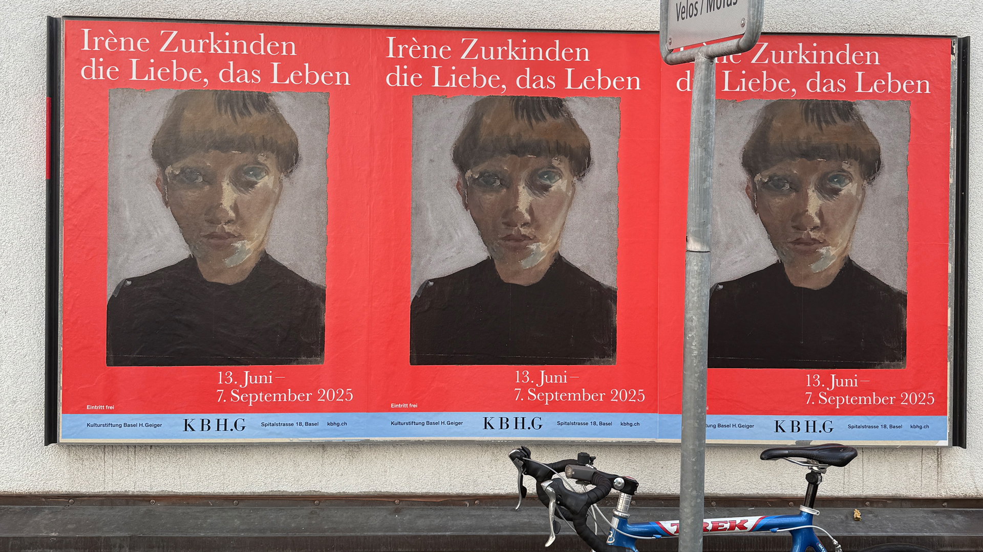
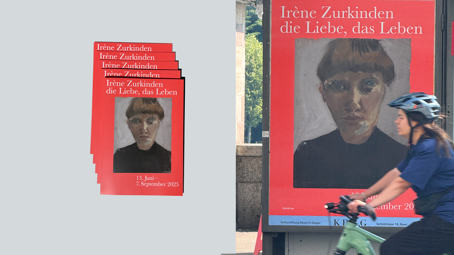
Book design: Irène Zurkinden: Love, Life
Edited by Kulturstiftung Basel H. Geiger, published by Hatje Cantz
Texts by Marie-Eve Celio-Scheurer, Rebecca Eigen, Florian Illies, Quinn Latimer, Raphael Suter, Reto Thüring
English
July 2025, 312 Pages, 120 Photos, 248mm x 336mm
ISBN: 978-3-7757-6073-7
Irène Zurkinden: Love, Life is a tribute to an artist who explored life and society through her drawings and paintings with an observant, thoughtful gaze. The exhibition invites a renewed understanding of an artist who engaged with questions of identity, belonging, and expression throughout her life, displaying how groundbreaking her art was then and how relevant it remains today. The exhibition was curated by Rebecca Eigen and Reto Thüring with Elsa Himmer


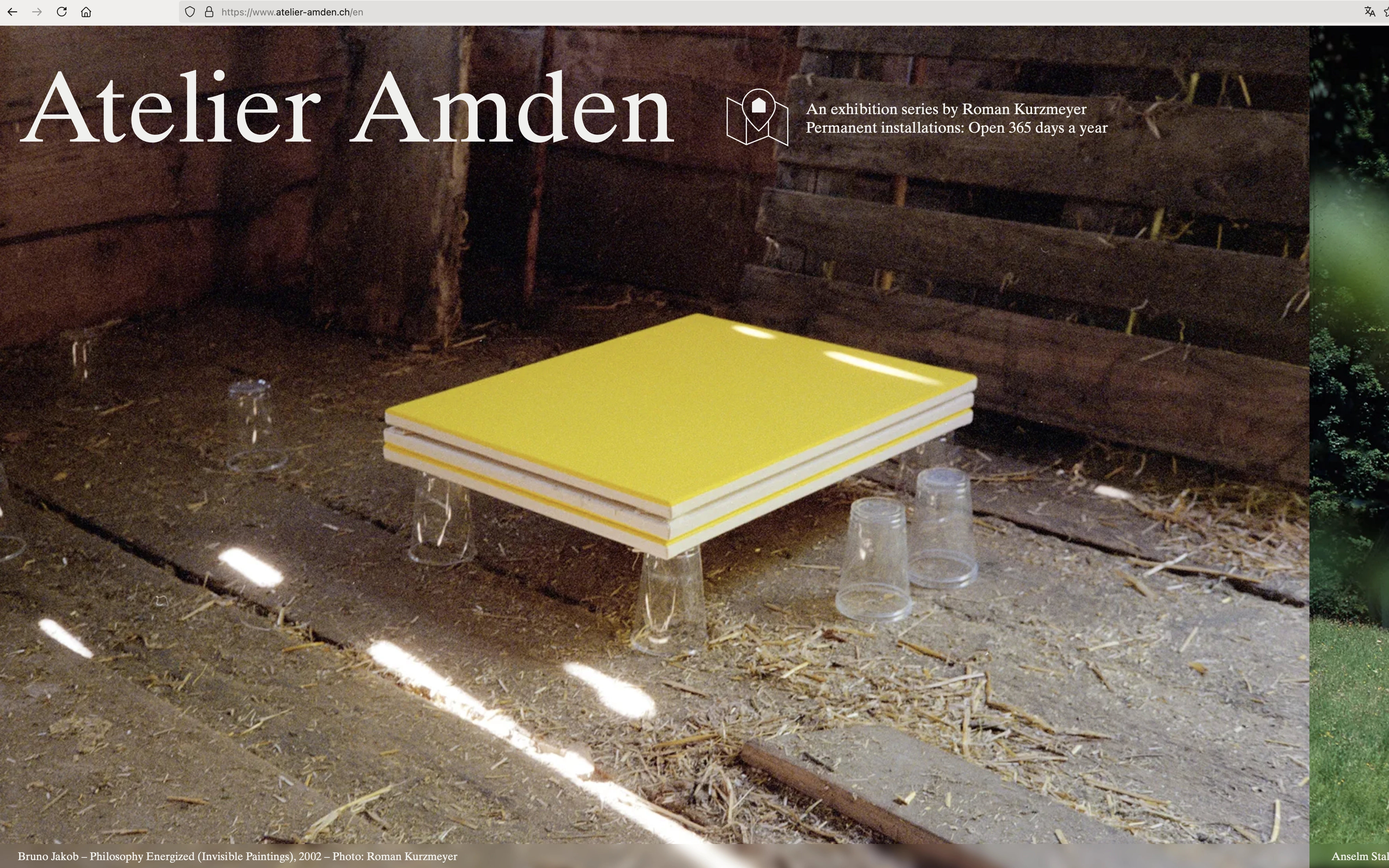
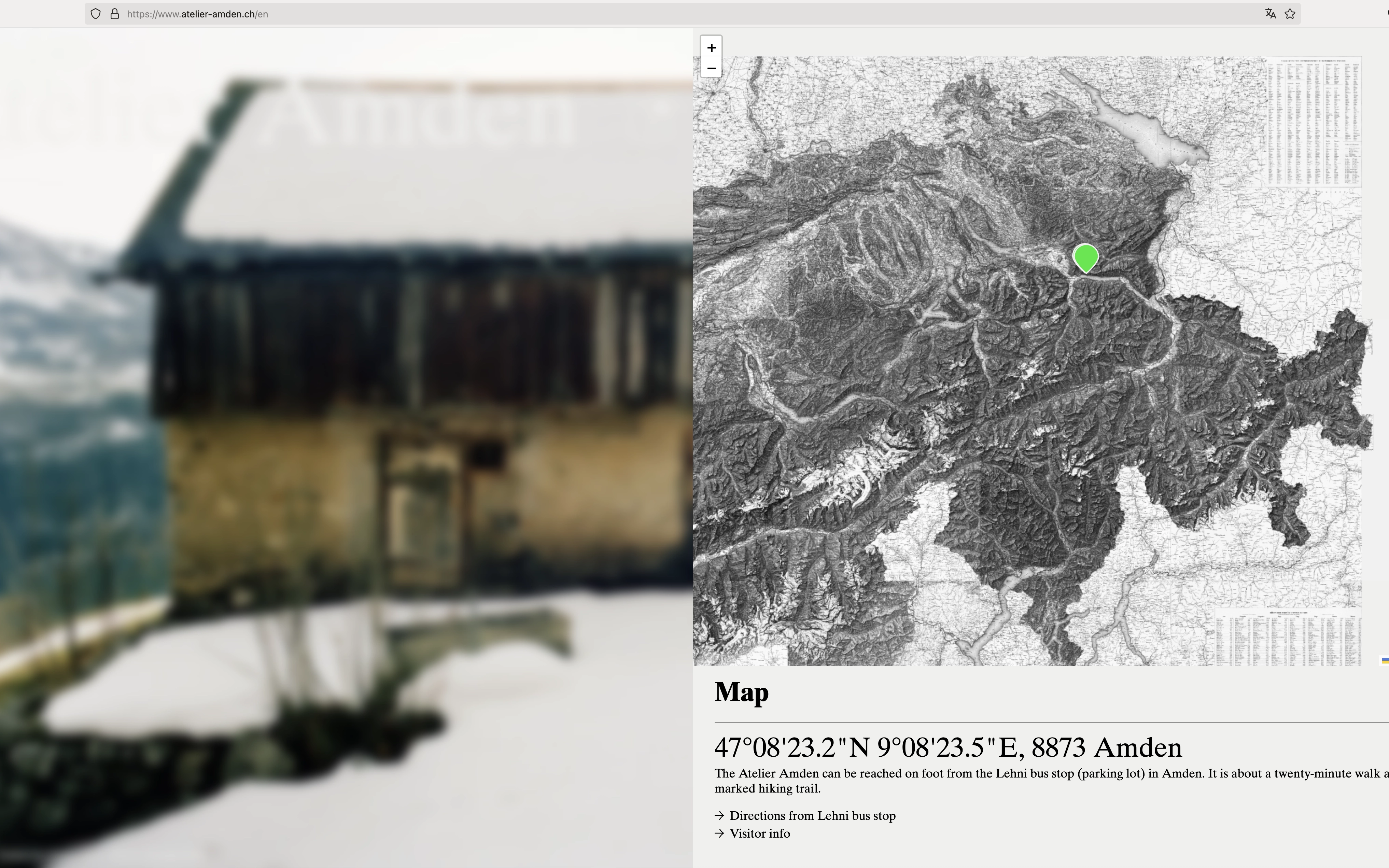
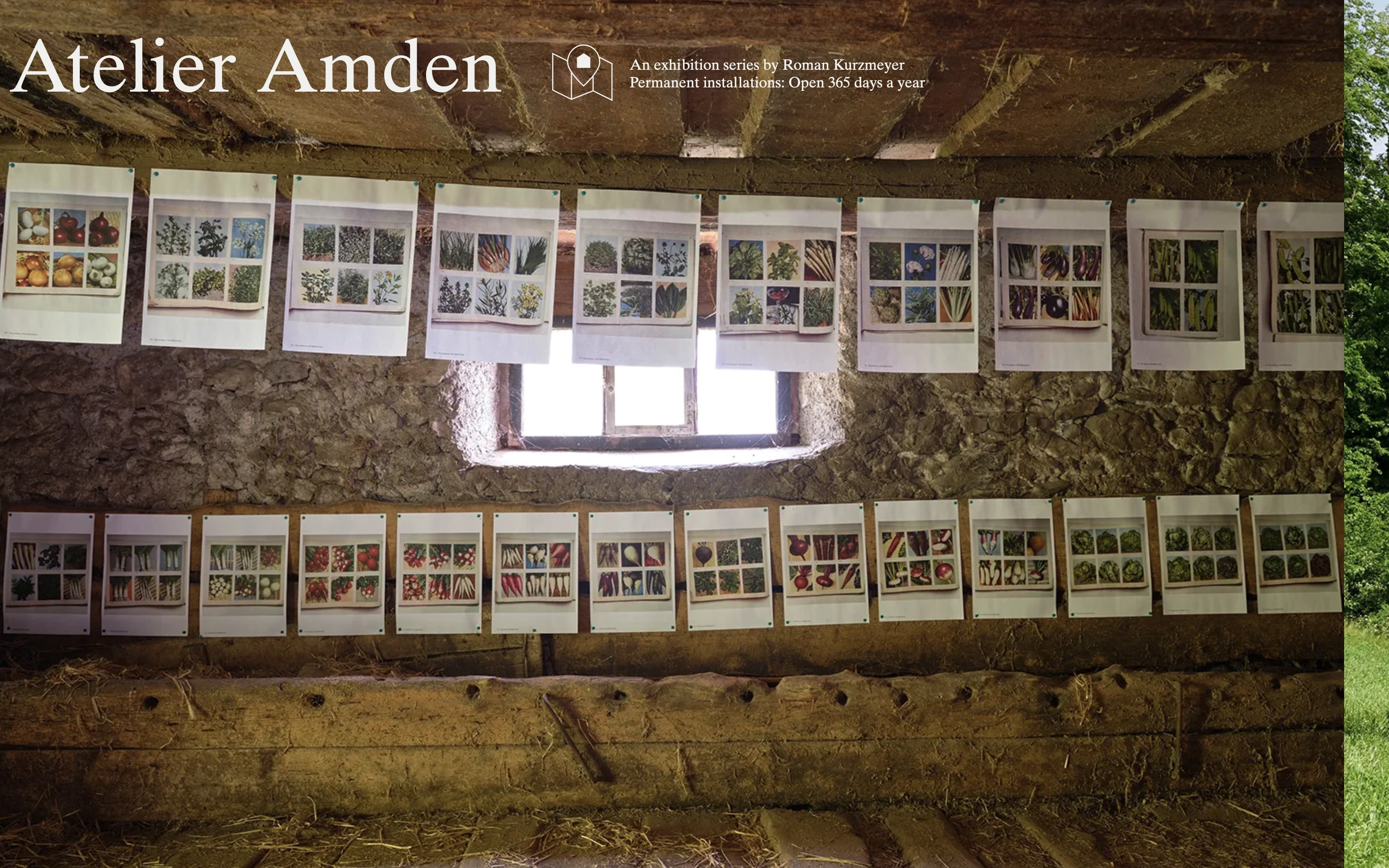
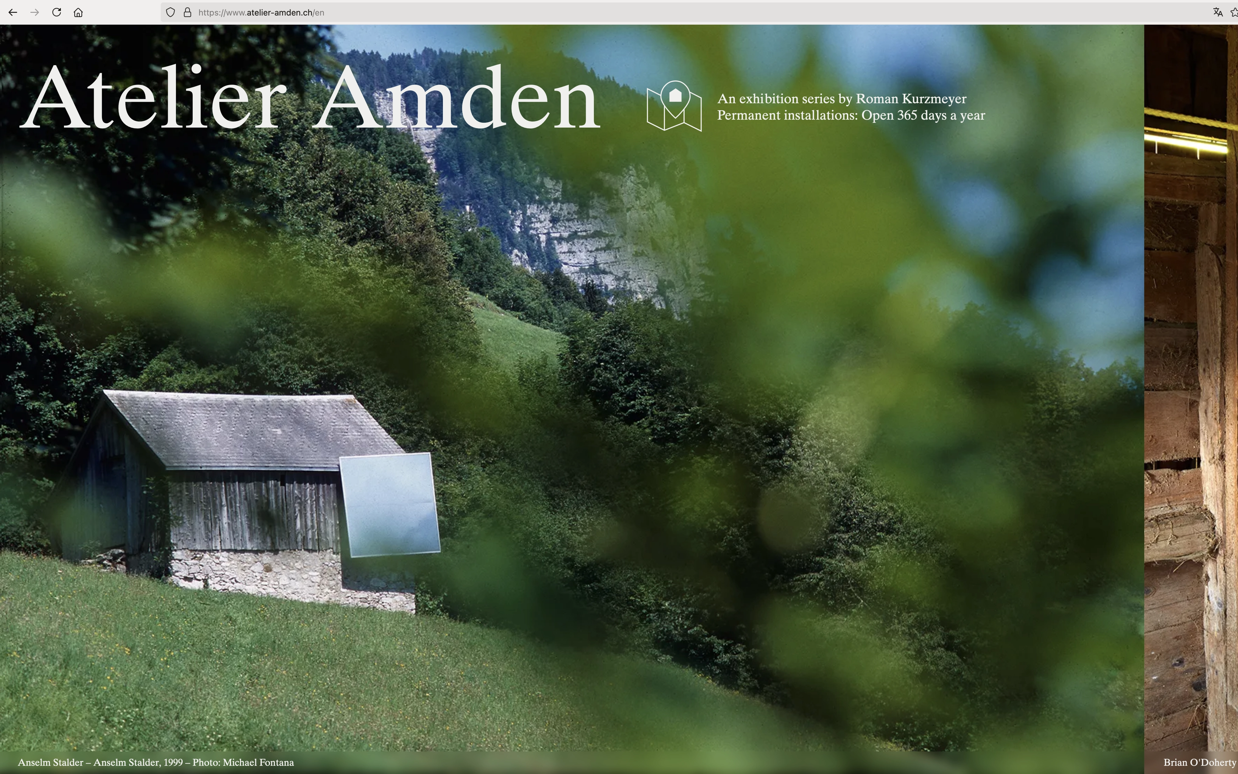
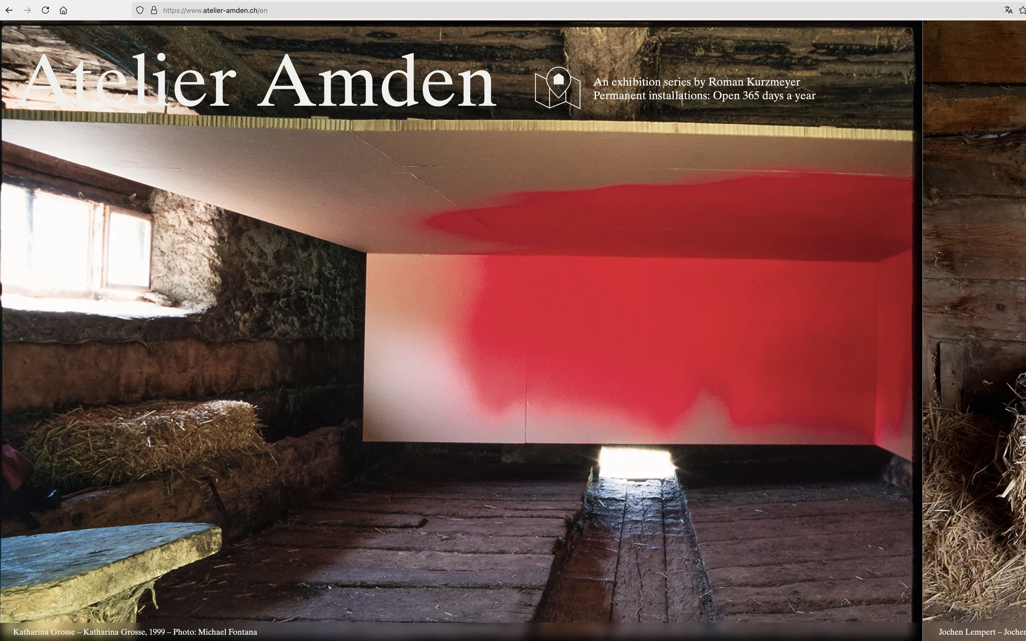
Conception and art direction of the website atelier-amden.ch/en
Programming: Computed By
Founded by Roman Kurzmeyer, Atelier Amden is free and open to the public 365 days a year. In addition to curated exhibitions throughout the year, visitors are welcome to experience the Atelier’s Permanent Installations any time. Subscribe to the newsletter for details on upcoming exhibitions and events. Location: 47°08'23.2"N 9°08'23.5"E, 8873 Amden
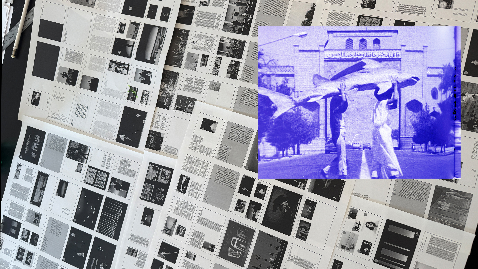


Paris Internationale 8: October 18—23
35, boulevard des Capucines, 75002 Paris
For its 8th edition, Paris Internationale was lucky to be accompanied by renowned Swiss architecture studio Christ & Gantenbein, coordination and strategy by Marie Lusa.
Participants at the fair are selected both for their work in local and international contexts as well as the specific projects that they will bring to Paris. Aside from these leading galleries and their artists that together drive the discourse in contemporary art, Paris Internationale also regularly hosts non-profit spaces, which aren’t charged a participation fee to make their contributions to contemporary art available to an international audience.


Love Letter, Deborah–Joyce Holman
June 10–July 22, 2023
Galerie Gregor Staiger, Zurich
Don’t Worry, This Will All Be Over Soon,
Tita Cicognani, Guillaume Dénervaud,
Gabriele Garavaglia, Jim C. Nedd, Jan Vorisek
April 13—July 1, 2023
Galerie Gregor Staiger, Milan
Lune rousse reflet, Caroline Bachmann
February 4—March 18, 2023
Galerie Gregor Staiger, Zurich

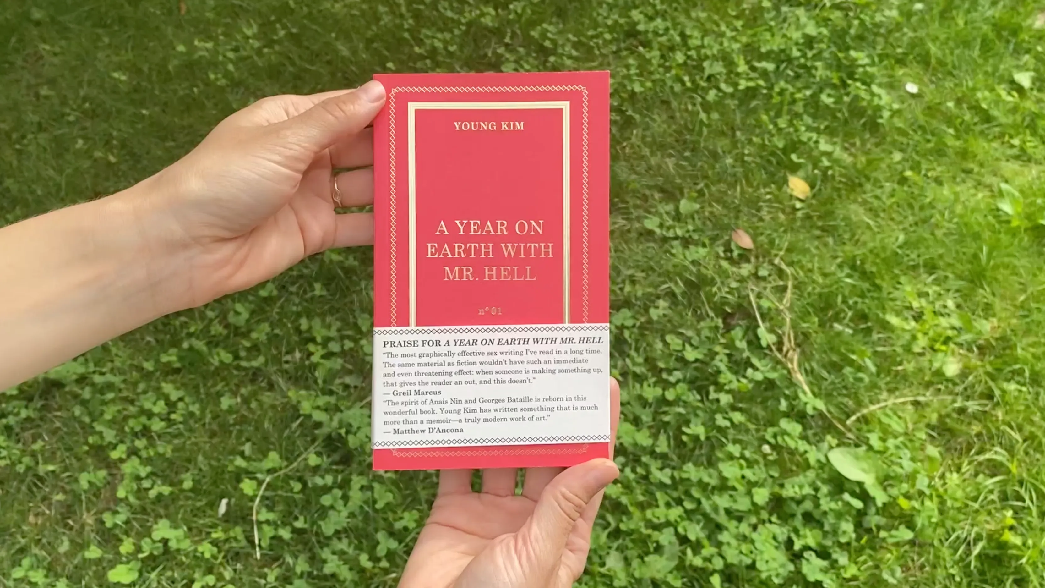
A Year on Earth With Mr. Hell is the critically acclaimed début memoir by Young Kim. The book explores a liberated woman's erotic experience in a clandestine affair without the clichéd political and cultural stereotypes of modern gender roles. It has garnered accolades from Bret Easton Ellis, Nick Hornby, Greil Marcus, Matthew D'Ancona, Michael Bracewell and Helen Rumbelow.
Publisher: Ubu Gallery Limited, 2020


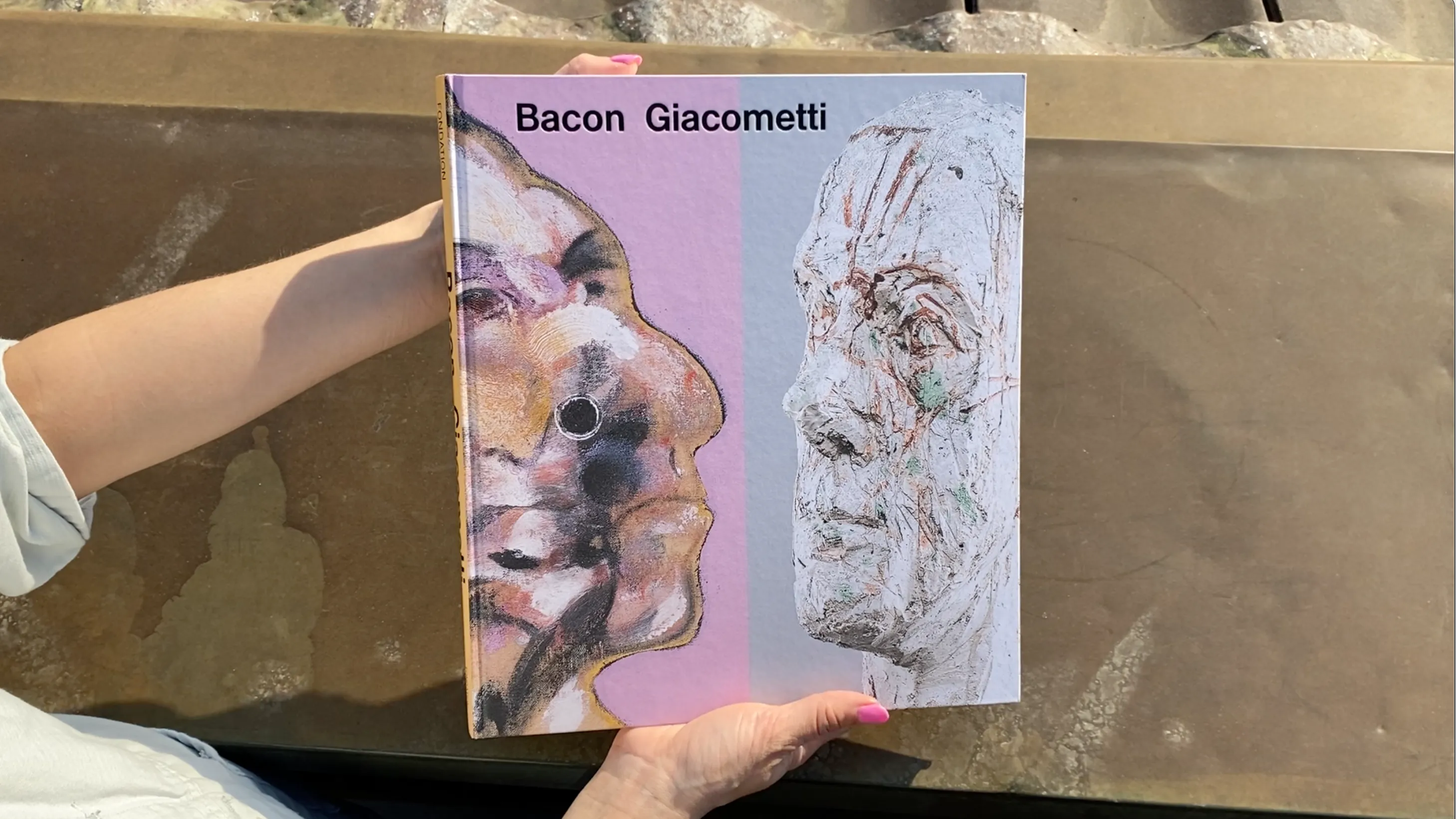
MONET MITCHELL for the Fondation Louis Vuitton Direction de l’ouvrage: Suzanne Pagé, Angéline Scherf, Marianne Mathieu.
Catalogues d’exposition
Date de parution : 05/10/2022
Format : 270 x 300 mm, 240 pages
Code EAN : 9782754112833
MONET MITCHELL explores the artistic parallels between Joan Mitchell (1925–1992) and Claude Monet (1840–1926), who lived and worked in the same area outside of Paris at different moments in time, responding to a shared landscape. Mitchell achieved recognition in the New York scene in the 1950s before gradually settling in Paris at the end of the decade and establishing her studio in 1968 in Vétheuil—where Monet lived for several years. The book establishes a dialogue between Monet’s late works and Mitchell’s paintings following her move to France and the 24 years she spent living and working around Monet’s former residence. The publication includes numerous works by both artists and brings together two exceptional ensembles—Monet’s Agapanthus triptych and Joan Mitchell’s Grande Vallée, a unique and major cycle of 21 paintings. Essays explore the significance of Mitchell’s work from this key moment in her career and the significance of the later paintings of Monet.
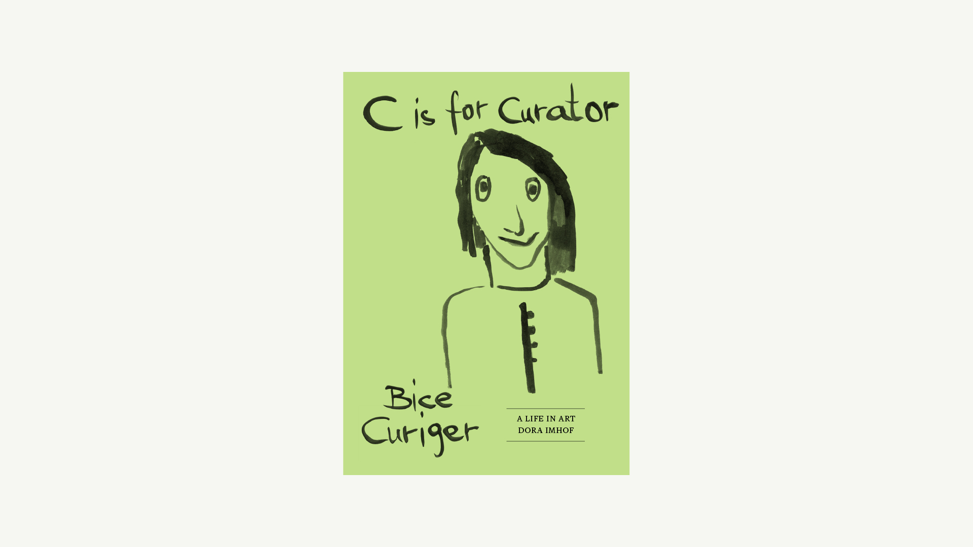
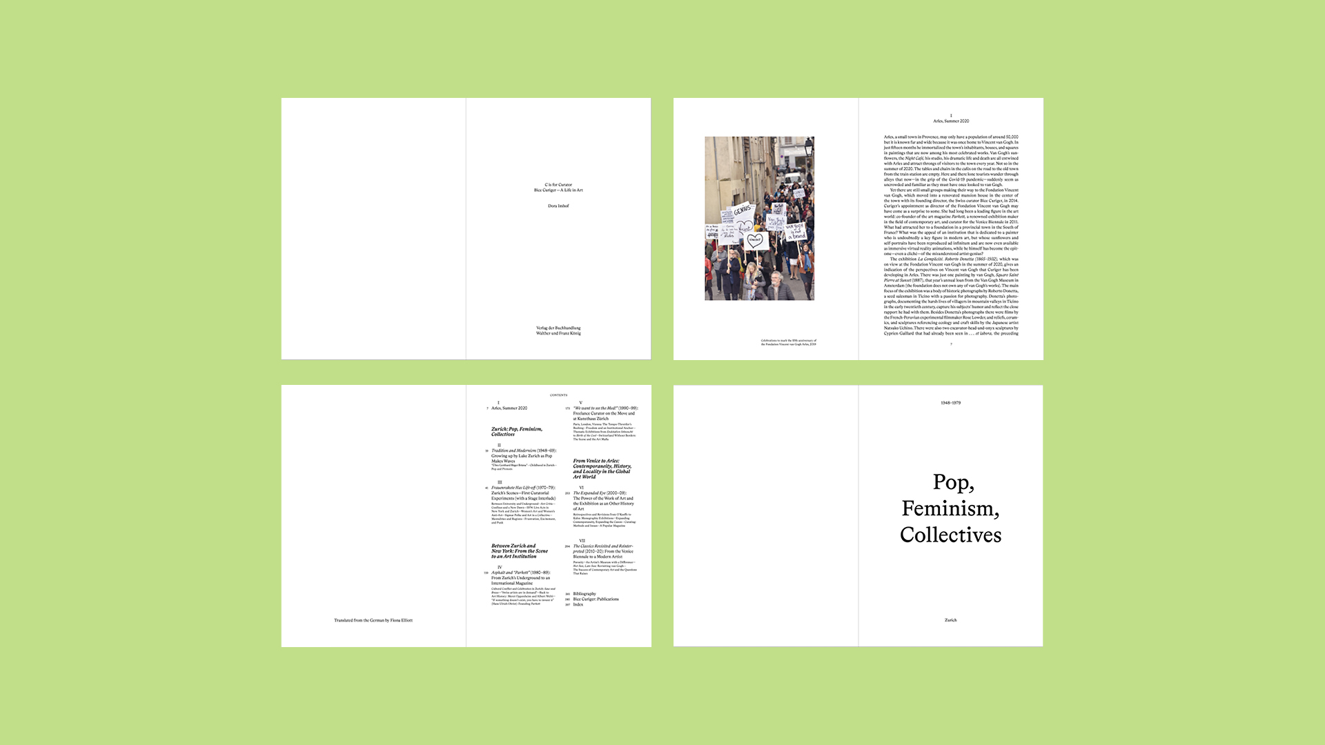
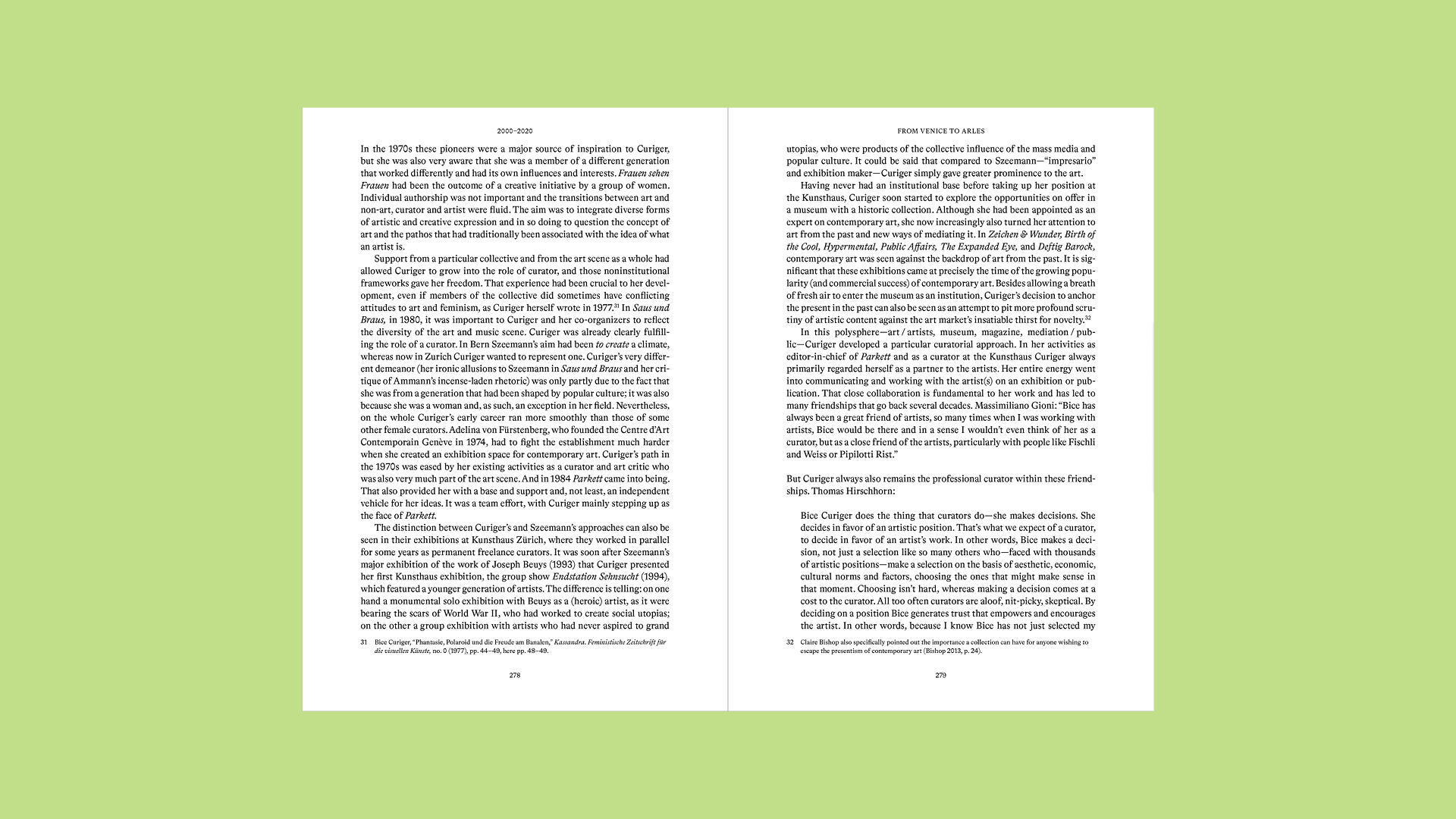
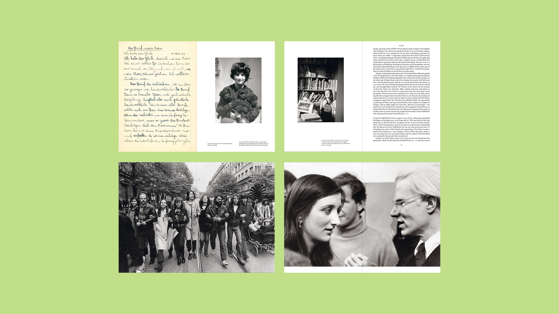
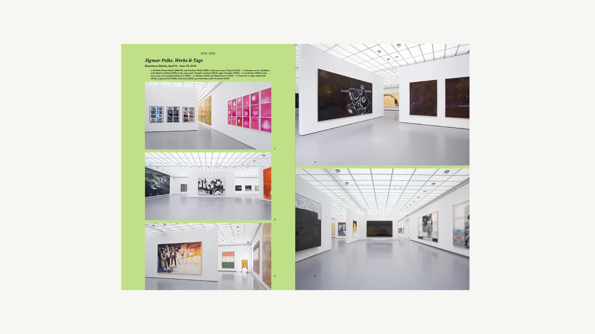
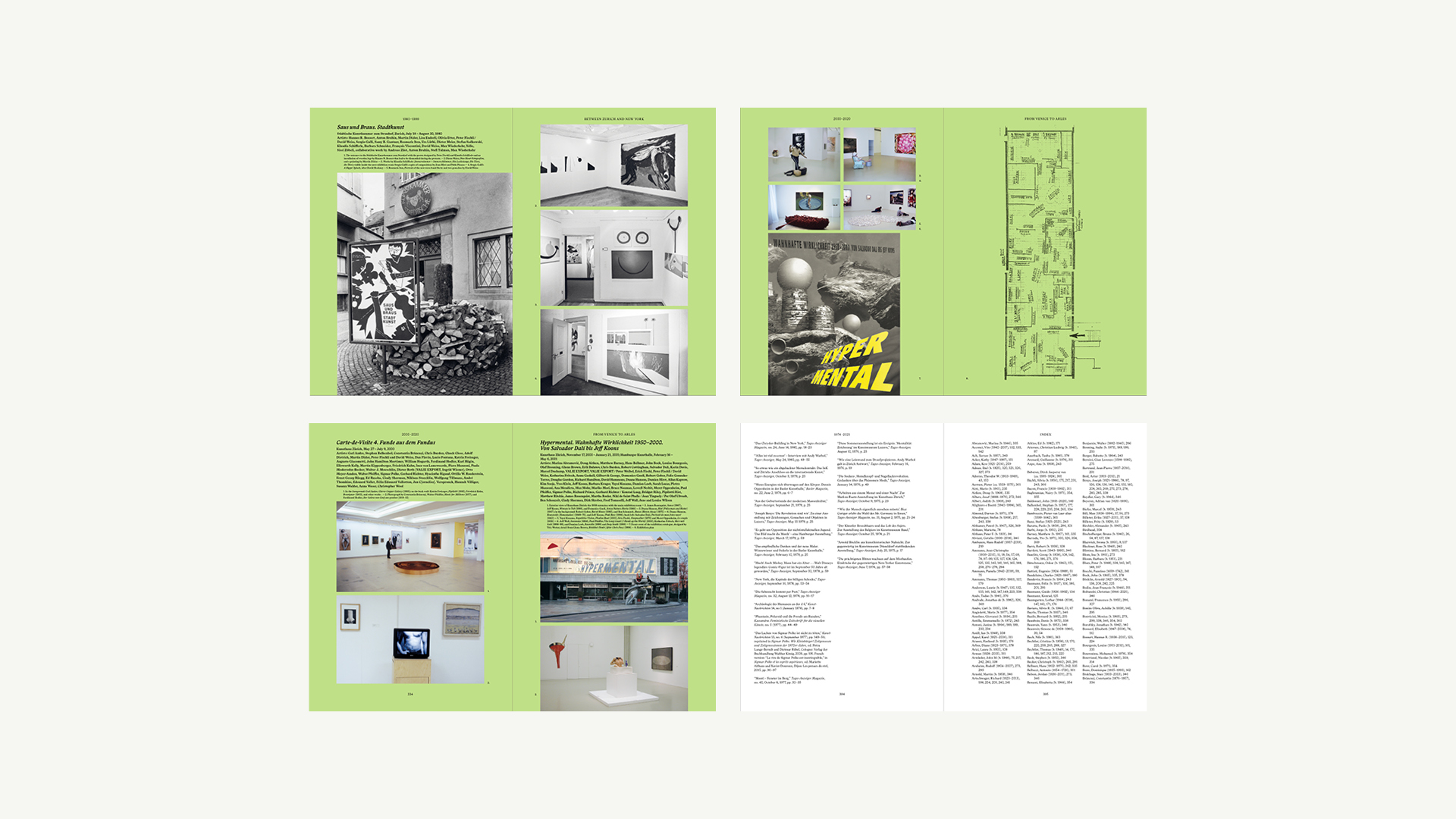
A working biography of Parkett Co-Founder & Editor-in-Chief Bice Curiger
C IS FOR CURATOR: BICE CURIGER - A LIFE IN ART. Edited by Dora Imhof. Contributions by Katharina Fritsch, Kathy Halbreich, Thomas Hirschhorn, Massimiliano Gioni, Dora Imhof, Hans Ulrich Obrist, Nicholas Serota an Philip Ursprung. Walther Koenig, Cologne 2022. 18,5 x 25,8 cm. 404 pages with 209 (80 coloured) pictures. Edition Patrick Frey
This biography by the art historian Dora Imhof illuminates the manifold activities of the curator, editor, and writer Bice Curiger. For the first time all of Curiger's exhibitions are documented and analyzed in depth-from Frauen sehen Frauen (Zurich, 1975) to the 2011 Venice Biennale to her current projects at the Fondation Vincent van Gogh Arles. Curiger's trajectory is contextualized within the history of curating, the globalization of the art world, and the institutionalization of contemporary art over the last four decades. Statements by leading artists and fellow curators provide personal insights into Bice Curiger's thinking and ongoing work.


Visual Identity and website for Christ & Gantenbein. This corporate identity is based on the use of sans-serif typography, with the typefaces Univers & Rand. The logotype composed in Univers 55, expresses a factual and subtle elegance. The symmetry as a graphic system, brings clarity and a rational equilibrium to the ensemble. All tools of communication follow the logotype guidelines. In addition to the main font Univers, the second font, Rand Black, is used throughout as a small title to proved contrast, as well as work in smaller spaces.The connection between the digital materials (website, icons, social media etc) and the printed materials (stationary, printed presentations, posters etc) can be seen not only in the logotype, but in the general use of symmetry and balance. Every application of the logotype and accompanying text reflects these principals.
Programming: Computed By

Visual Identity and website for International Galleries Alliance (IGA).
International Galleries Alliance (IGA) is a non-profit professional alliance between art galleries. Through monthly meetings, research and an annual Summit, IGA creates new possibilities for support, offering a space for its members to access and share information, enabling collegiate dialogue and providing opportunities for mutual learning. The alliance looks to empower its members to respond to evolving virtual and physical contexts, working together to nurture creative environments that challenge dominant models and cultivate a positively plural and diverse gallery world.
Programming: ArtShell
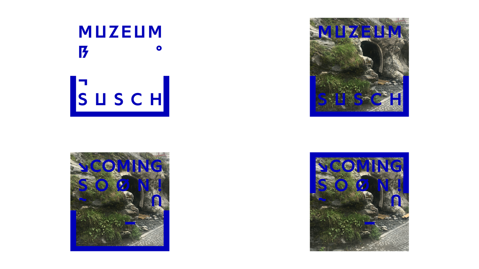
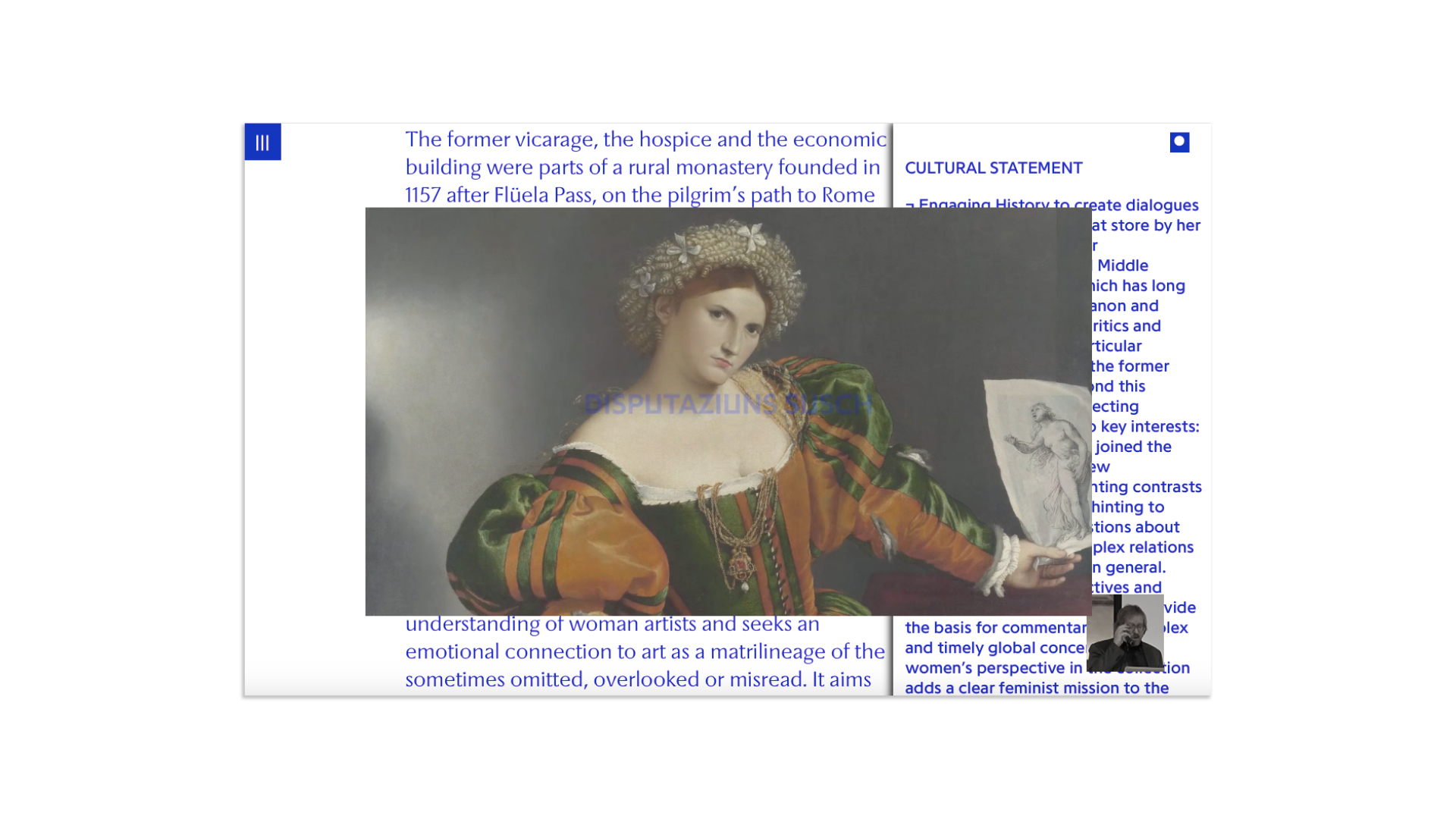
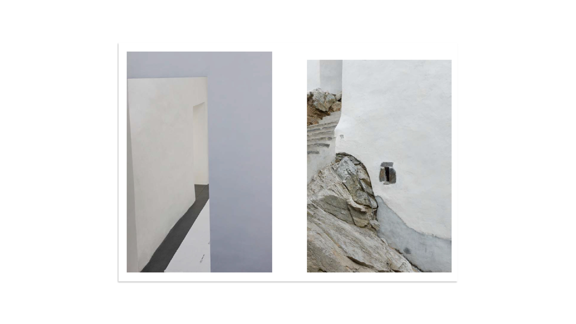
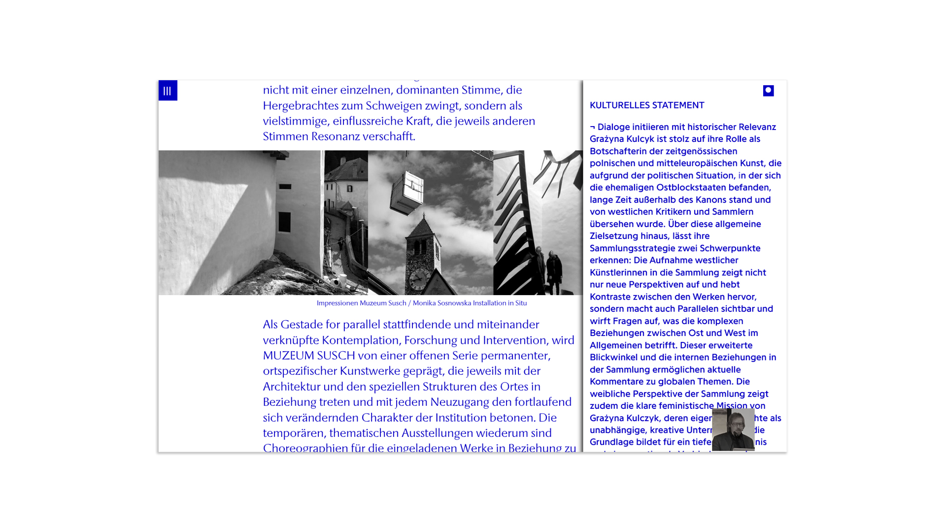
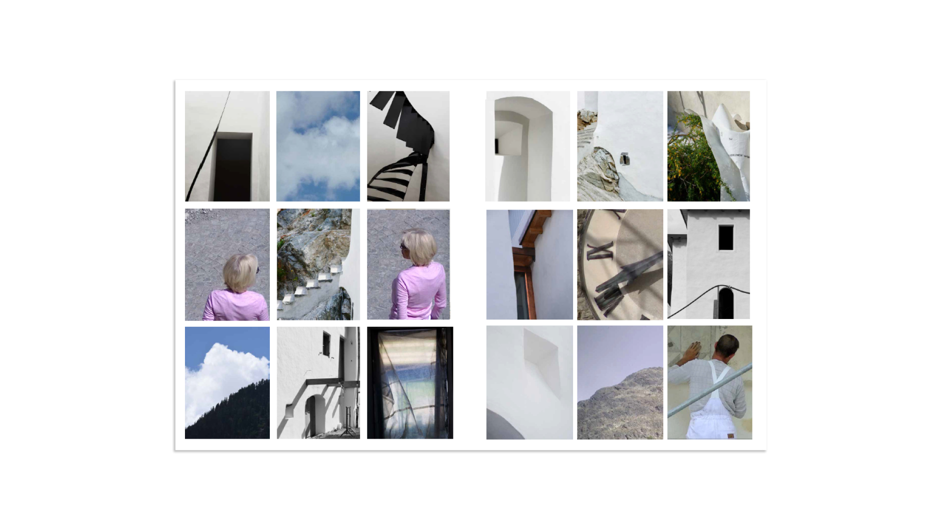
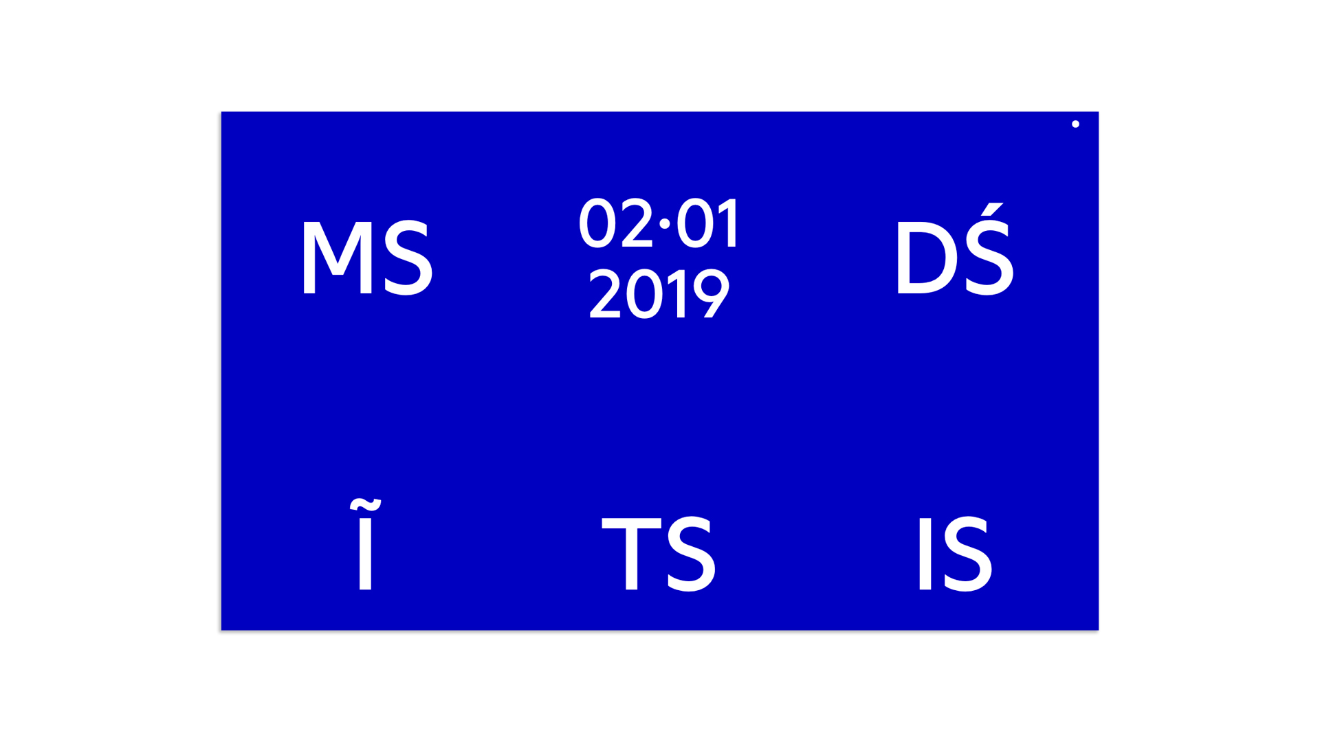
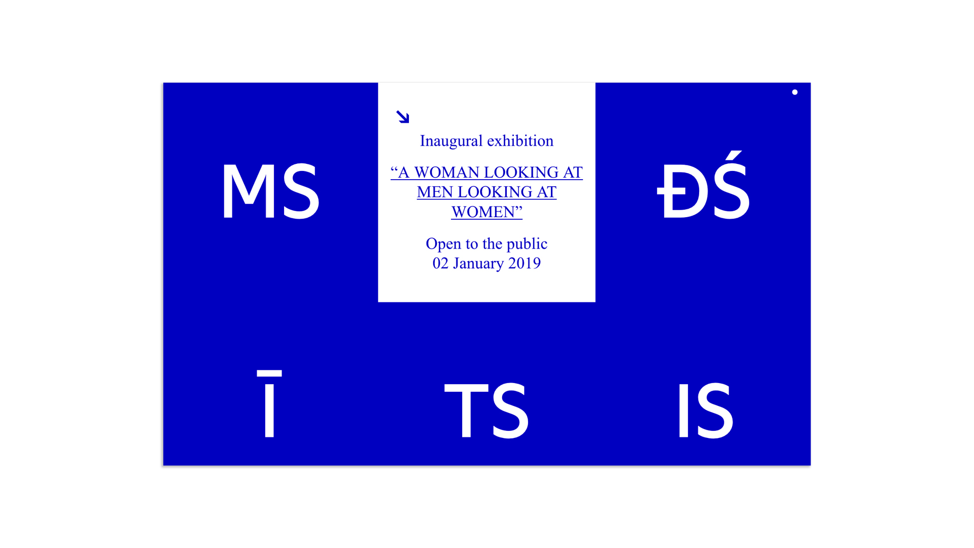
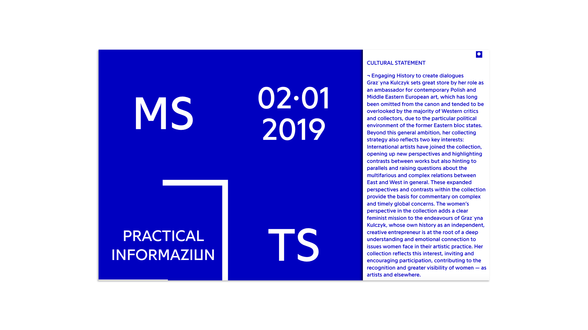
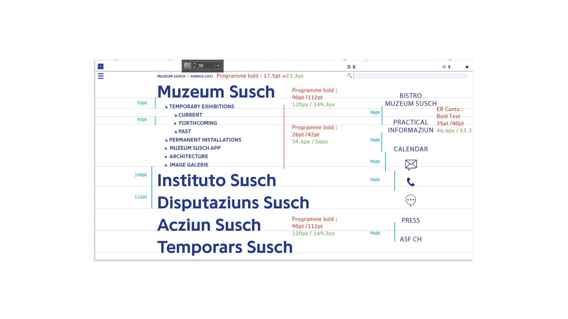
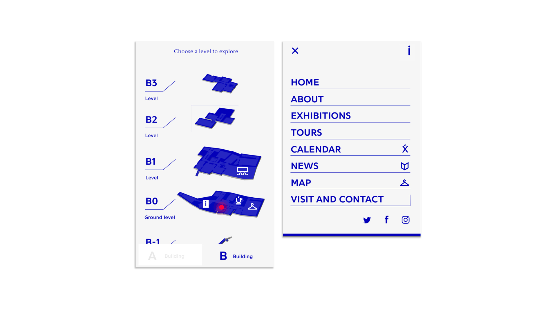
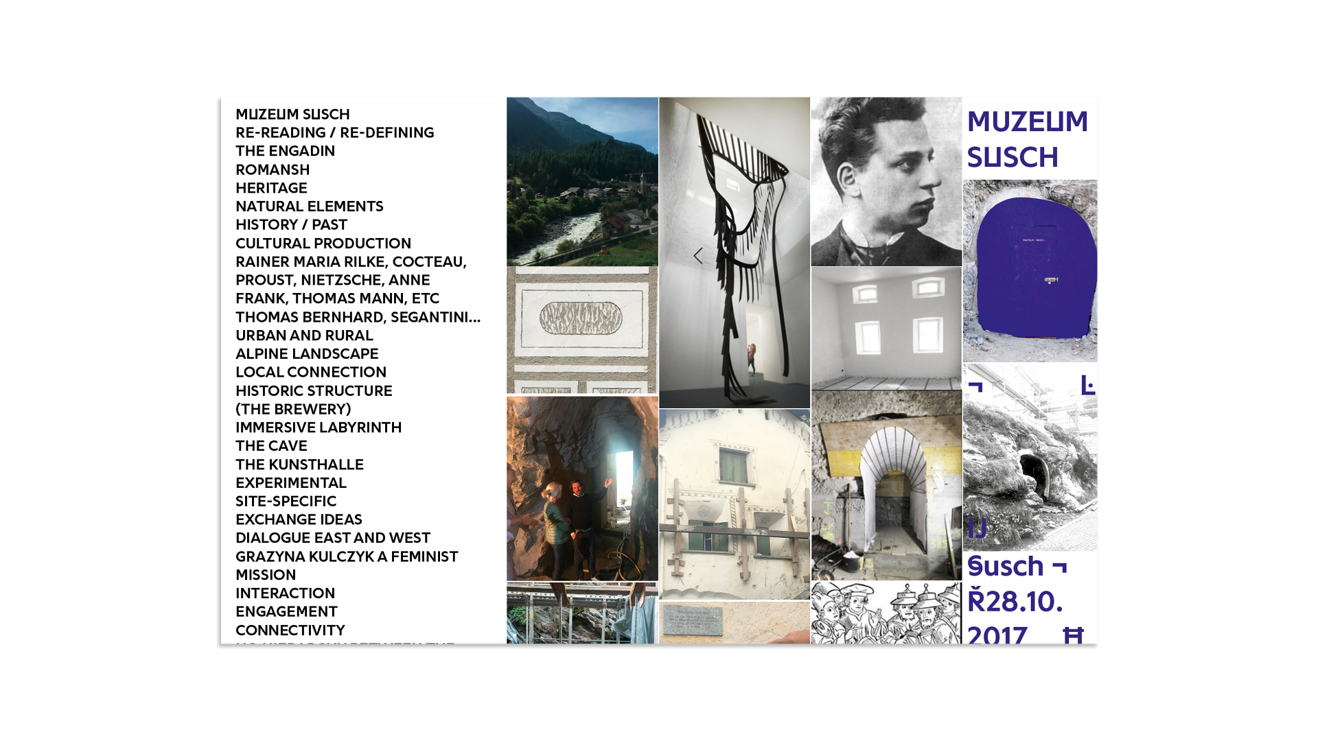
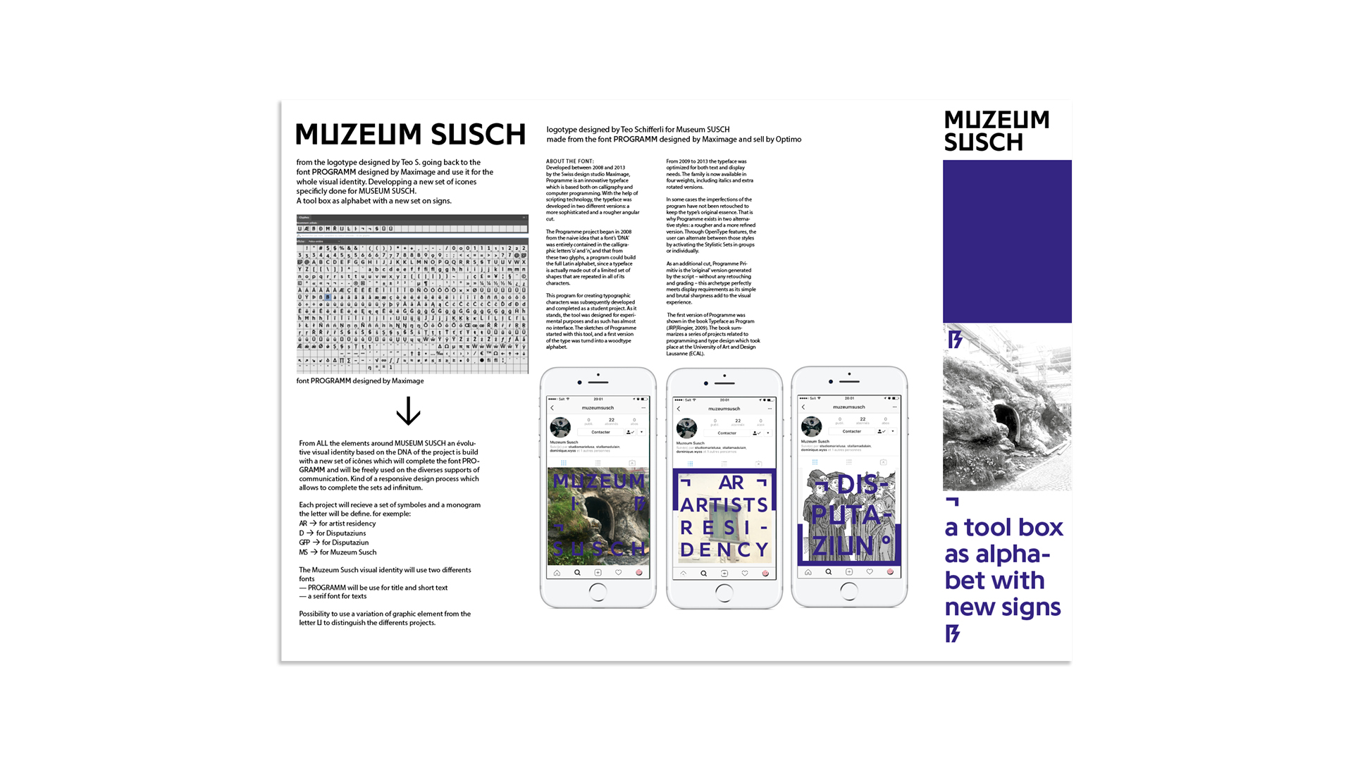
Visual identity for Muzeum Susch, Engadin, Switzerland https://www.muzeumsusch.ch
Art direction: Marie Lusa / Code: Computed·By
Art Stations Foundation CH. Founder of MUZEUM SUSCH and Chairwoman of Art Stations Foundation CH Board: Grażyna Kulczyk


Rise Project was a year long program curated by Silka Rittson Thomas for the Silvie Fleming Collection in 2015 at a derelict house on Lansdowne Rise in West London. Snails in Notting Hill was an intervention by the artists Nicolas Party and Jesse Wine.
Publisher: Silvie Fleming Collection, London

With texts from Anne Vieth, Stefan Zweifel, Paul Tanner
18 x 26.3 cm, 224 Seiten / Pages
Verlag der Buchhandlung Walther und Franz König / English Edition
The publication Set and Setting: Kerim Seiler 1997–2022 documents the work and activities of the artist Kerim Seiler from the beginnings of his career to the multifaceted large-scale projects that he has realized in public spaces and thus achieved notoriety beyond Zürich and Switzerland. In addition to its work-documentary character, the focus of the book is on imparting art-historical knowledge, because Seiler's oeuvre can be used to explain discourses and theorems that have had a decisive influence on the development of the visual arts over the past 60 years. From installation and performative work concepts to the situational understanding of art and site-specific art - Seiler's oeuvre deals with these and other art theoretical methods and approaches,

Pastel, Nicolas Party 2014
Yesterday, Vittorio Brodmann 2014
Feminax, Lucy Stein 2014
Polaroids 1972–2021, Walter Pfeiffer 2021
Published in editions of 1000 copies each by Galerie Gregor Staiger, Zurich
Lithography by Georg Sidler
Print Musumeci S.p.A, 30 pages

Marie Lusa currently teaches at ÉCAL cantonal art school of Lausanne in the department Master of Type Design.
Browse the final Diploma Projects.


